Open post
TOGAF Maturity Analysis 2

TOGAF Maturity Analysis 2

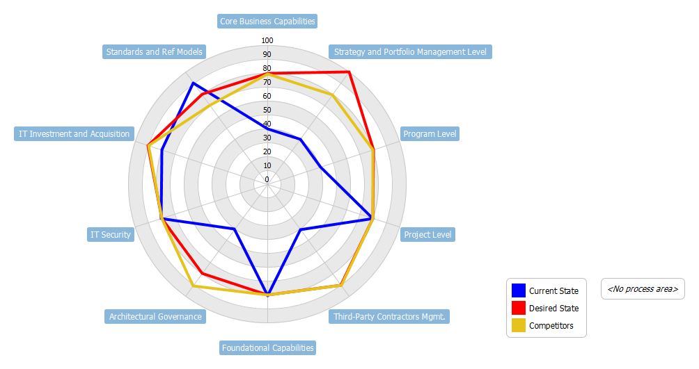
Here is a radar chart example that shows how it can be used for maturity analysis.

TOGAF advocates the use of maturity models as a tool to assess the current status of an organisation (within a predefined scope and process area(s)).  The clear mappings of the process maturity levels both at current and future states (or even including the competitors’ maturity level of references) make it an ideal tool to communicate the planned roadmap.

Graphical representation of the maturity levels can be easily recorded via spreadsheet as shown here.

Import into your Project

Posted by:

Open post
Hospital Admission of Asthma in Italy

Hospital Admission of Asthma in Italy

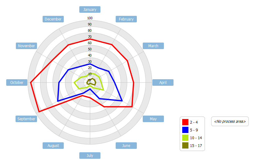
This is a simple radar chart example that shows the status of hospital admission. Radar chart of monthly hospital admissions for asthma by age group in Italy. Note: All figures include only ordinary hospitalizations, except where otherwise specified. Data

source: Ministry of Health.

Import into your Project

Posted by:

Open post
Cookies Comparison

Cookies Comparison

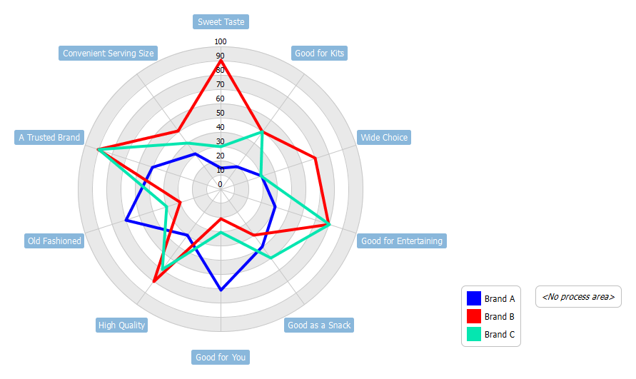
Radar Chart Example - This example shows all 10 product attributes for three cookie brands by comparing all attributes and getting a sense of where they stand out and how they compete against each other

Import into your Project

Posted by:

Open post
Products Sold

Products Sold

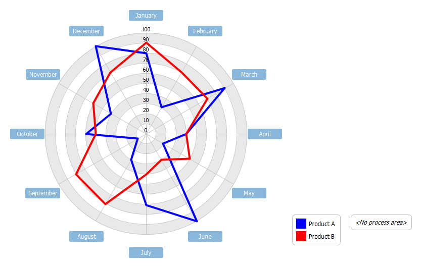
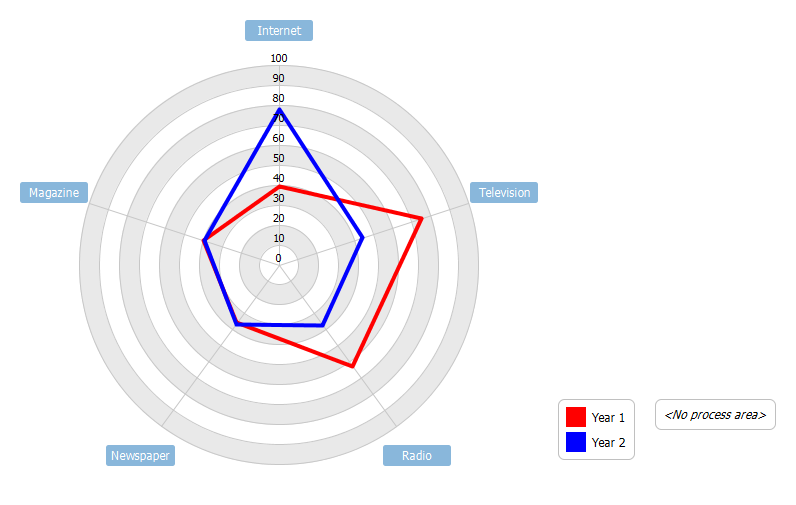
Radar Chart Example - A radar chart is a graphical method of displaying multivariate data (e.g. different features of an item, time periods etc). These graphs look a bit like spider webs, with each variable represented by arms starting from the same point and spread out in a circle. A line is drawn connecting the data values for each arm so it looks like a star. This helps us identify the frequency of each observations and whether there are any outliers. This example compares the annual sales performance of product A and B. The annual sales per 100 units of two products are shown in the following radar chart.

Import into your Project

Posted by:

Open post
Advertising Budget Analysis

Advertising Budget Analysis

Radar charts will illustrate, graphically, the size of gaps amongst several organizational Key Performance Indicators (KPI) by highlighting the area where improvements are needed most. A typical radar chart, also called a spider chart or star chart, makes concentrations, strengths and weaknesses much more visible. Radar charts plot the values of each category along a separate axis starting from the centre of the chart and ending at the outer ring. In a Radar chart, a point close to the centre indicates a low value and a point near the perimeter indicates a high value. If it’s done well, it clearly defines full performance in each category. A well executed radar chart is a good way to answer the question, “How are we doing?”.

This radar chart example analyses the change in advertising spending for a company over two consecutive years.

Import into your Project

Posted by:

Open post
Average Monthly Temperatures

Average Monthly Temperatures

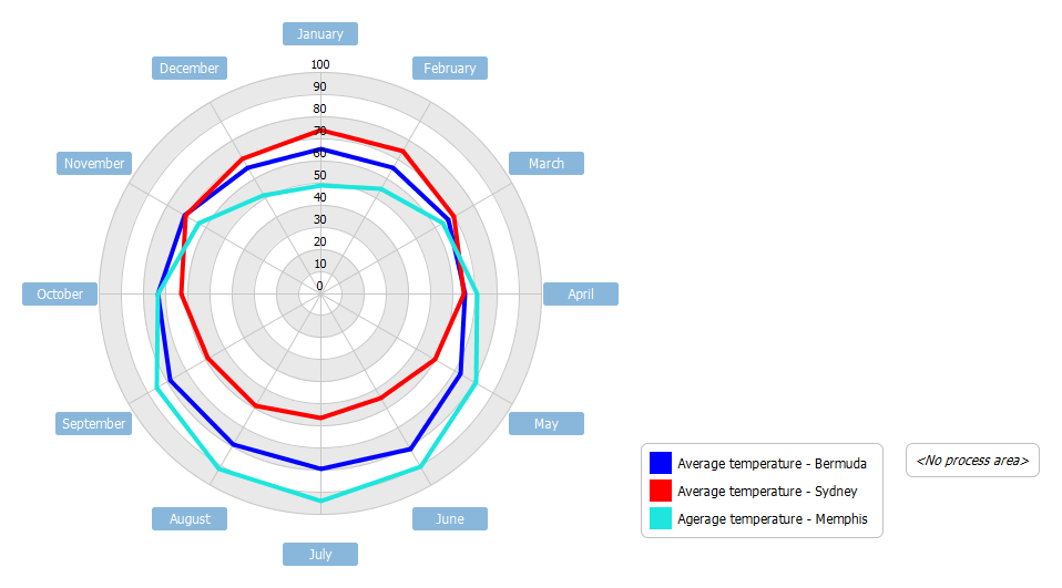
Radar Chart Example - Radar charts are useful when you want to look at several different factors all related to one item. Radar charts have multiple axes along which data can be plotted. In a radar chart, a point close to the centre on any axis indicates a low value.

To demonstrate the use of radar chart, we will compare the average monthly temperature for three cities; a Northern hemisphere ocean moderated location, a Southern hemisphere ocean moderated location, and my home town Memphis, TN.

Import into your Project

Posted by:

Open post
Budget Allocation

Budget Allocation

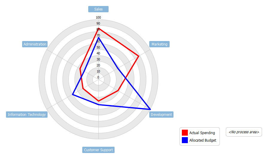
Radar charts are a useful way to display multivariate observations with an arbitrary number of variables. Each star represents a single observation. Typically, radar charts are generated in a multi-plot format with many stars on each page and each star representing one observation. This spider chart represents the allocated budget versus actual spending for a given organization.

This is a simple radar chart example for budget allocation.

Import into your Project

Posted by:

Open post
TOGAF Maturity Analysis

TOGAF Maturity Analysis

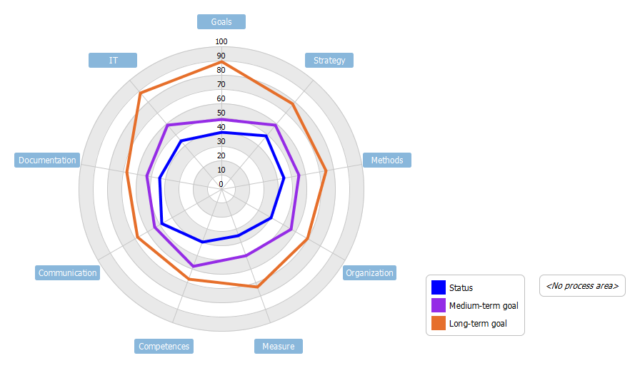
Radar Chart Example - Radar Chart, also known as spider chart, is a way of comparing multiple quantitative variables. This makes them useful for seeing which variables have similar values or if there are any outliers amongst each variable. Radar Charts are also useful for seeing which variables are scoring high or low within a dataset, making them ideal for displaying performance.

The example consists of nine categories: goals, strategy, methods, organizing, evaluation, competencies, communication, documentation and IT. The five maturity levels range from "chaotic" (level 0) to "sustainable" (level 5) summarizing the result of the evaluation process together with medium- and long-term goals.

Import into your Project

Posted by:

Open post
Event Driven Process Chain Diagram – With Annotation

Event Driven Process Chain Diagram – With Annotation

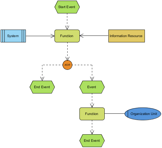
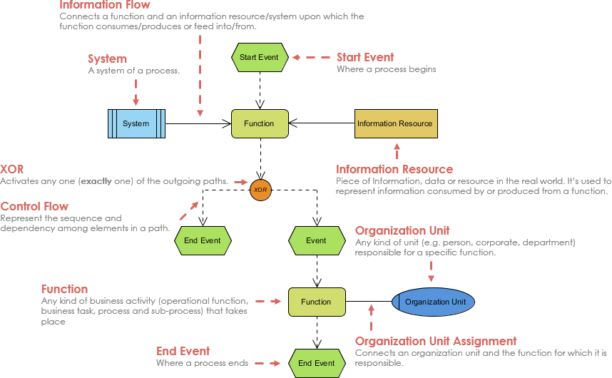
An event-driven process chain (EPC) is a type of flowchart used for business process modelling. EPCs can be used for configuring an enterprise resource planning (ERP) implementation, and for business process improvement. Usage for control of work share with instances of autonomous workflows in workflow management is possible, but not yet implemented.

Here is a simple EPC diagram example that shows the use of annotation in the diagram.

Import into your Project

Posted by:

Open post
Goods Arrival

Goods Arrival

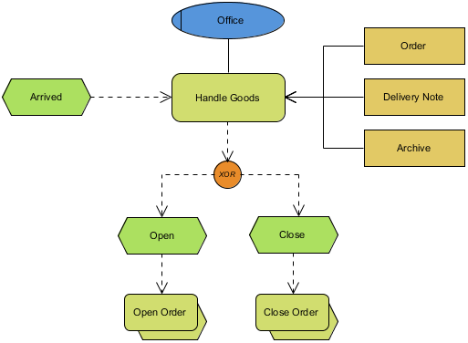
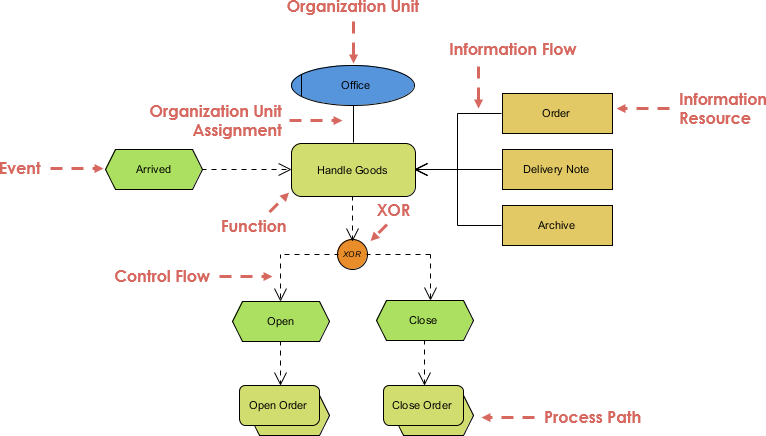
EPC diagram, abbreviation for event-driven process chain diagram, is a flowchart based diagram that can be used for resource planning and identifying possible improvements of a business process. In this EPC diagram example, we use organization unit, control flow, process path, function and information resources.

Import into your Project

Posted by:

Posts navigation

1 2 3 20 21 22 23 24 25 26 42 43 44