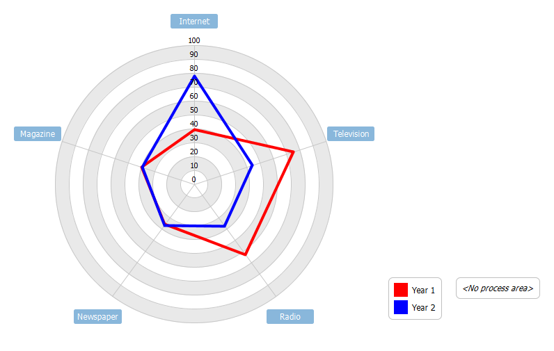
Radar charts will illustrate, graphically, the size of gaps amongst several organizational Key Performance Indicators (KPI) by highlighting the area where improvements are needed most. A typical radar chart, also called a spider chart or star chart, makes concentrations, strengths and weaknesses much more visible. Radar charts plot the values of each category along a separate axis starting from the centre of the chart and ending at the outer ring. In a Radar chart, a point close to the centre indicates a low value and a point near the perimeter indicates a high value. If it’s done well, it clearly defines full performance in each category. A well executed radar chart is a good way to answer the question, “How are we doing?”.
This radar chart example analyses the change in advertising spending for a company over two consecutive years.
Import into your Project
Open diagram in Visual Paradigm [?]Copy the URL below, paste it in the Open Project windows of Visual Paradigm and press Enter to open it |
Posted by: Steven Guarino
