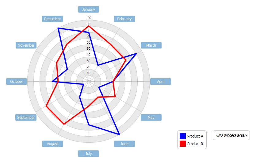
Radar Chart Example - A radar chart is a graphical method of displaying multivariate data (e.g. different features of an item, time periods etc). These graphs look a bit like spider webs, with each variable represented by arms starting from the same point and spread out in a circle. A line is drawn connecting the data values for each arm so it looks like a star. This helps us identify the frequency of each observations and whether there are any outliers. This example compares the annual sales performance of product A and B. The annual sales per 100 units of two products are shown in the following radar chart.
Import into your Project
Open diagram in Visual Paradigm [?]Copy the URL below, paste it in the Open Project windows of Visual Paradigm and press Enter to open it |
Posted by: Brittany Shook
