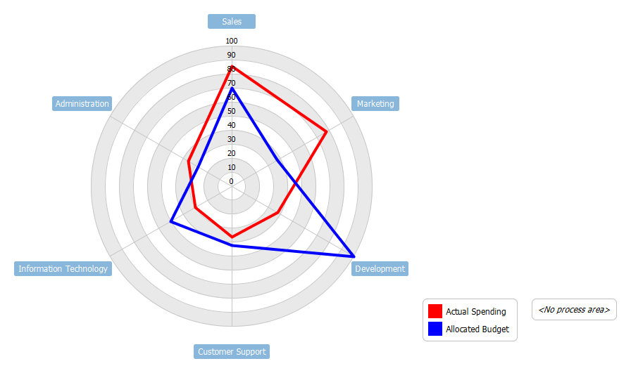
Radar charts are a useful way to display multivariate observations with an arbitrary number of variables. Each star represents a single observation. Typically, radar charts are generated in a multi-plot format with many stars on each page and each star representing one observation. This spider chart represents the allocated budget versus actual spending for a given organization.
This is a simple radar chart example for budget allocation.
Import into your Project
Open diagram in Visual Paradigm [?]Copy the URL below, paste it in the Open Project windows of Visual Paradigm and press Enter to open it |
Posted by: Willie Gonzalez
