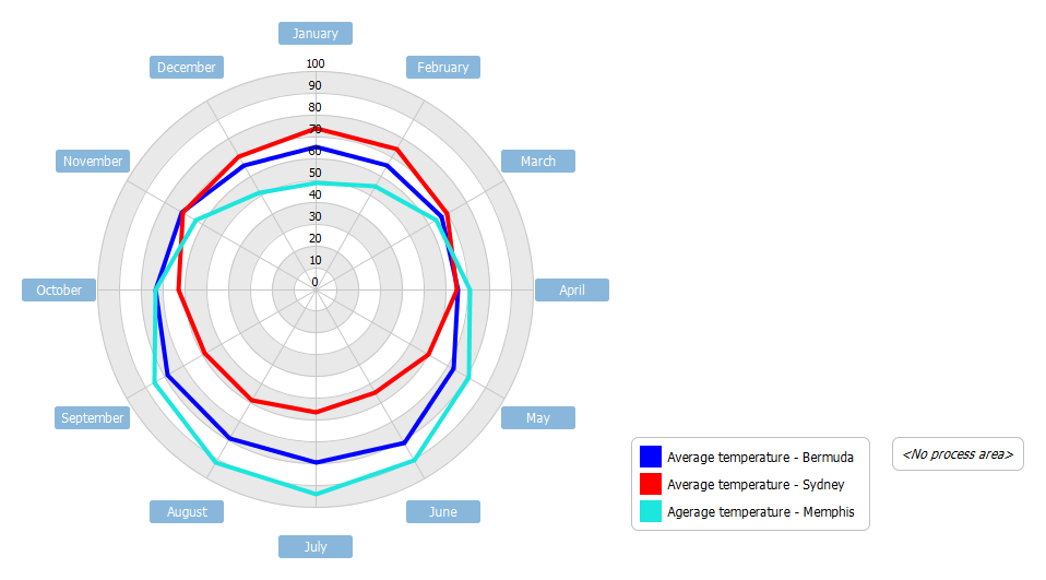
Radar Chart Example - Radar charts are useful when you want to look at several different factors all related to one item. Radar charts have multiple axes along which data can be plotted. In a radar chart, a point close to the centre on any axis indicates a low value.
To demonstrate the use of radar chart, we will compare the average monthly temperature for three cities; a Northern hemisphere ocean moderated location, a Southern hemisphere ocean moderated location, and my home town Memphis, TN.
Import into your Project
Open diagram in Visual Paradigm [?]Copy the URL below, paste it in the Open Project windows of Visual Paradigm and press Enter to open it |
Posted by: Ricardo Poole
