Open post

Eliminating Project Risks

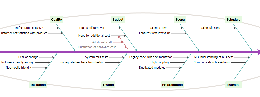
This is a Fishbone Diagram example.

Software could be associated with serious problems, the adoption of agile methods are not immune to such troubles. In order to identify what can go wrong in a project, a project team brainstorm with a cause-and-effect analysis also Ishikawa or fishbone diagram. The value of the analysis is to systematically list all the possible problems that any occur, such as schedule slips might be obvious, but others such as scope creep (the desire to add features after the analyst hears new stories) or developing features with little value are not as obvious.

Import into your Project
Open post

Top-down Work Package Estimation

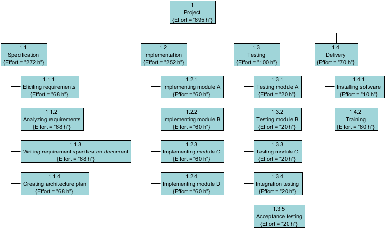
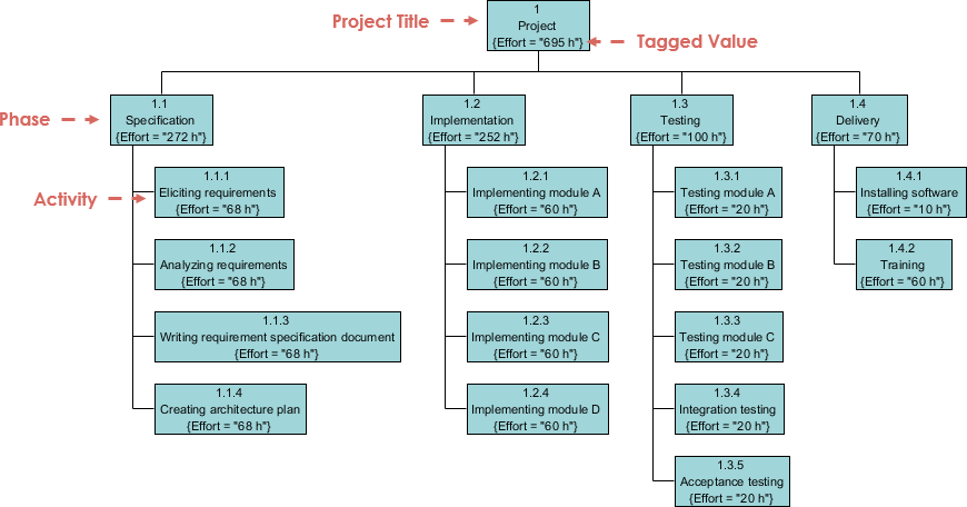
This is a quick work breakdown structure example.

Idea: Allocate proportions of an effort estimate to different activities of the project

Inputs: Main project activities (high level design) and earlier project data on efforts spent for activities

Outputs: Rough work breakdown with corresponding effort estimates

Advantages: Takes into account integration, configuration management and documentation costs (e.g. algorithmic models seldom take)

Disadvantages:  Underestimating the difficult low-level technical problems

Import into your Project
Open post

Prepare Project Proposal

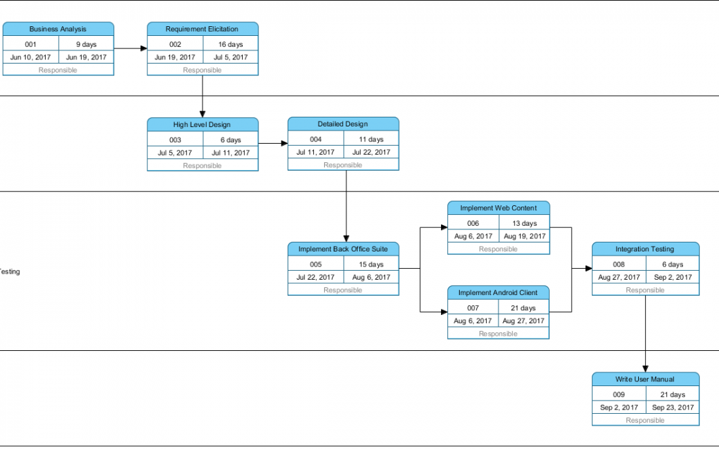
This is a PERT Chart example.

Suppose a systems analyst is trying to set up a realistic schedule for the data gathering and proposal phases of the systems analysis and design life cycle. The systems analyst looks over the situation and lists activities that need to be accomplished along the way, and formed a PERT Chart.

Import into your Project
Open post

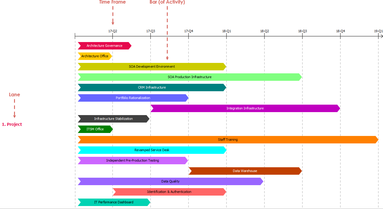
Implementation Plan Diagram – Software Project

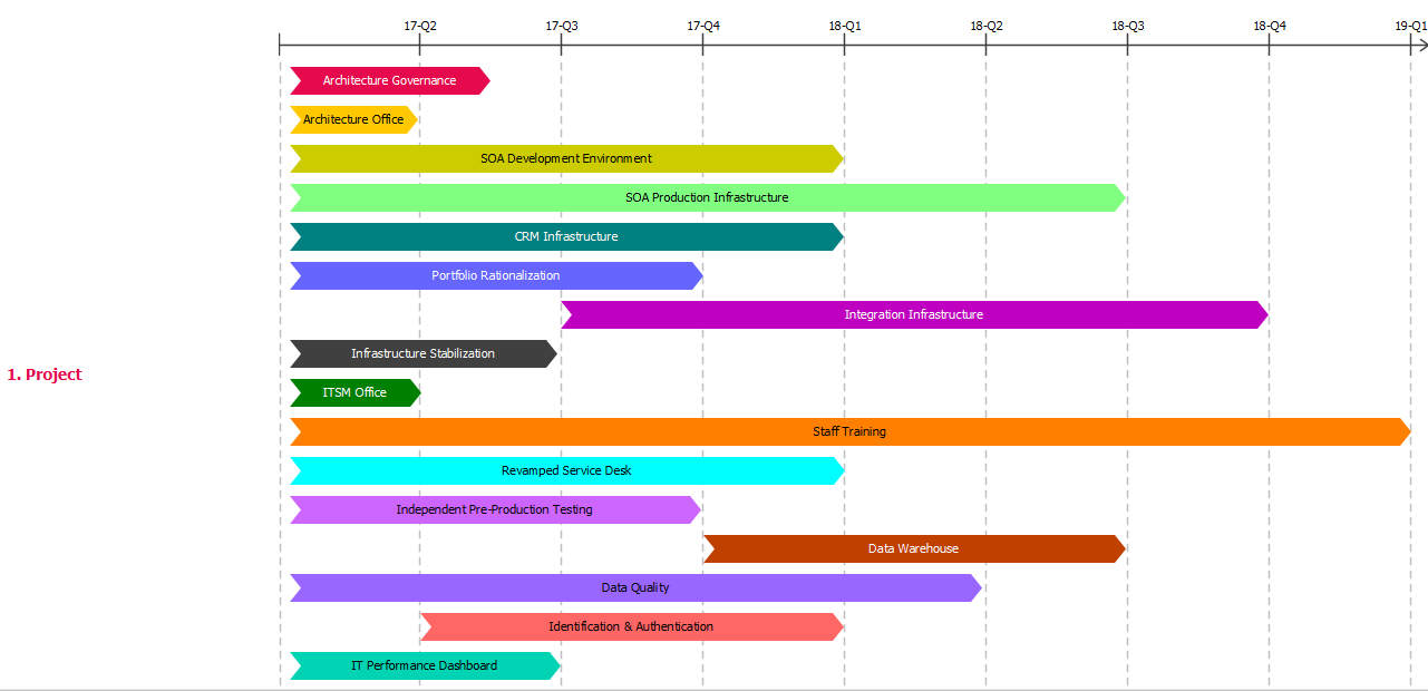
This is an example of software project roadmap.

Missed deadlines, forgotten milestones, and messy spreadsheets cut the motivation, and lead to lower work productivity. Working without a clear project plan will lead your team to a crossroad with no clear action plan. Project management timeline helps to set clear directions and priorities by keeping everyone will be on the same page. Your entire team knows which tasks need to be completed next, as the priorities have been set aside clearly in the first place. Thus, everyone's goals and objectives are likely agreed and aligned together. The example illustrates the implementation plan of a SOA software project for an enterprise architecture initiative

Import into your Project
Open post

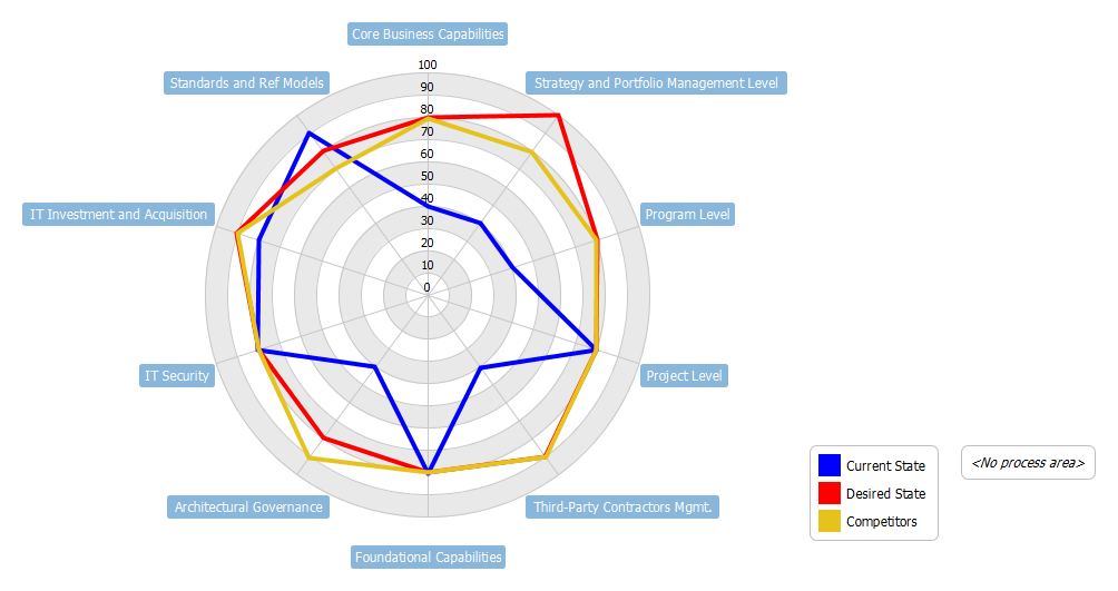
TOGAF Maturity Analysis 2

This example shows the use of radar chart in performing maturity analysis (the TOGAF way).

TOGAF advocates the use of maturity models as a tool to assess the current status of an organisation (within a predefined scope and process area(s)).  The clear mappings of the process maturity levels both at current and future states (or even including the competitors’ maturity level of references) make it an ideal tool to communicate the planned roadmap.

Graphical representation of the maturity levels can be easily recorded via spreadsheet as shown here.

Import into your Project
Open post

What is On-Demand Model ETL

Effective visual modeling with On-Demand Model ETL. Design your desirable views of model data in a tabular form for bulk-view/edit/prioritize/visualize using Model ETL big data technology.

Hi everyone. This is Jick Yeung from Visual Paradigm. In this video I am going to introduce you to a modeling approach that makes visual modeling more effective. The approach is called the On-Demand Model ETL.

Throughout this video I will explain the idea of On-Demand Model ETL with the help of this use case model. This is a use case model for an online shop.

There are actors like Buyer, General Visitor, Affiliate and Seller.

There are use cases like Search Product, Place Order, Cancel Order, Create Account, Advertise Items, etc.

This use case model provides an overview of all the goals to be achieved by the online shop.

Throughout a software project there are different stakeholders who have different interests and expectations on the system. For this reason they have different perspectives on a model.

For example, the scrum product owner is interested in the priority of use cases in order for him to perform release planning. The project manager might want to estimate the costs of use cases and keep monitoring the costly ones to ensure that the project can be completed within the approved budget.

A project involves many different people with different interests and concerns. Visual model, as a medium for conveying messages to different parties, has to be flexible enough to accommodate different information needs.

How can a visual model function effectively in such a condition? Let’s consider these aspects.

The first one. How to discuss and brainstorm effectively?

Take the use case model for the online shop as an example. In prioritizing use cases, the cost of use cases is probably not a factor to consider. In order to facilitate a discussion that’s centered around relevant information and not being distracted by non-interested details, it is necessary for a model to purposefully convey and capture information.

A model that can purposefully convey information is nice but not enough. Think of the need of prioritizing use cases again. Prioritization is the result of comparison between use cases. It can be difficult to perform the comparison just by viewing a use case diagram because the use cases can be scattered anywhere. Therefore, it’s vital for a model to support a holistic view and editing interface on a selected kind of model element.

An effective model is not a silo but connected with other models in contributing the on-going design, analysis and communication needs throughout a software project.

Take the use case model as an example. Once the use cases are prioritized, the scrum product owner can pick-out those important ones, and present them on a new diagram specialized for release planning. To facilitate on-going project development, it’s important that a model can be transformed and evolved from one form into a new form.

Visual Paradigm has introduced a visual modeling approach to support all these needs, and the approach is called On-Demand model ET.

The word ETL comes from a popular concept in data warehousing. It stands for Extract, Transform and Load, three database functions.

The idea is simple.

Extract, is the process to read data from a database

Transform, is the process to convert the extracted data to another form.

Load, is the process to write the transformed data into the target database.

We apply this concept in visual modeling, becoming On-Demand Model ETL.

The idea is still simple.

You extract model elements from a source, which is typically a diagram. Here I use a use case diagram as example, but the concept applies to every other diagram types.

Alright, a list of elements is extracted, forming a table of model elements, and with their properties as columns. For example, you have a table of use cases, and with their name, description, ID as columns. And we call the table ETL table.

Transform is the process to manipulate the extracted elements via the ETL table. The beauty of this process is that you are allowed to attach custom properties to the extracted elements. I’ll show you how to do this later on in the demo session.

Load, is the process to visualize a selected set of elements in the ETL table in a new diagram. This means that if you need to prioritize use cases now, you can extract all use cases into an ETL table, adjust their priority and form a new diagram with those use cases in high priority. If later on you have the perform cost estimation, create another ETL table with all use cases, estimate their cost, form another diagram that contains the costly use cases that aids cost control.

Don’t worry if you do not fully understand. I will re-iterate the concept in the demo session.

Before we go into the demo session, let me give you a brief summary on the On-Demand Model ETL.

On-Demand Model ETL is an approach to effective visual modeling. It’s not a merely a feature, but an approach. The approach consists of a method, which is ETL, extract, transform and load. And some principles, which include creating multiple model views for different perspectives, promote model reusability to ensure data consistency, and bring order to scattered model element depicted on diagram.

Finally there are tools supported by Visual Paradigm for applying this modeling approach.

Alright, let’s see how to perform On-Demand Model ETL in Visual Paradigm. We’ll start from the letter “E”, extract.

This is a use case diagram for an online shop. Let's say I want to perform release planning by deciding the use cases to be completed in difference releases. In order to do this I have to prioritize the use cases. I will show you how to do this with On-Demand Model ETL.

First, create an ETL table.

Select ETL table from the diagram toolbar and click on the diagram. I want to edit the priority of use cases, so I name this table Use Cases Priority.

An ETL table shape visualizes the data in the underlying table. You may know what it is in a minute. Now, click on this button to associate the table shape with a table. Click here to create a blank table.

This is the interface of the ETL table. This is where you can list the model elements. I want to manipulate use cases, so I select Use Case here.

The use cases are extracted from the diagram and being listed in the table.

This is the name of the use cases. I can connect to sort them alphabetically.

This is the Description column. Since this part is about extracting in ETL, the ‘E’. I'm not going to manipulate the use cases right now. I will do this in the next part. For now I'll just close the ETL table and go back to the diagram.

As you can see the table data is presented in the diagram. You see the name and the description of the used cases. So with this ETL table you have a way to reveal the details of model elements without the need to open any specification window. Let me show you another usage.

This is a state machine diagram. There are some states – Placed, Paid, Shipping. And on the right hand side you can see an ETL I created before. It lists the states with their description.

This is an activity diagram. It has actions like Checkout Shopping Cart, Settle Payment and Request Pickup. Besides the actions I've also include the states in this diagram which are in pink. I did this because I wanted to present the change of states throughout an activity.

Here we have a problem. The reader of this activity diagram may not understand the meaning of the states. To solve this problem we can apply On-Demand Model ETL.

Again I create an ETL table. I name it States.

Click this icon.

Instead of creating a blank table, this time I select an existing ETL table here – “Description of Orders’ States”. Click Next.

I want the table to show both the name and description column, so I keep this unchanged and confirm. Fit the table size.

The ETL table is presented next to the diagram. It acts like a dictionary of states. If a reader is uncertain about the definition of the state “Refunding”, he can look-up the table and find that “Refunding” means the system is processing the refund resulted by a returned product.

This is how data extraction works. You create an ETL table, lists some model elements in it, and have the table data reflected back on the diagram. Now let's move on to ‘T’, Transform. As mentioned before we wanted to perform release planning by prioritizing the use cases. We will do this in this part.

Open the ETL table in the use case diagram.

These are the use cases. To prioritize the use cases, we need a new column to store the priority. Let’s add this column. Right click on the table header and select Add Custom Property Column.

I name it Priority. I want to restrict the value to be either High, Medium or Low. To do this create an enumeration. Select configure enumeration. Click New. Enter the name of enumerations, which is Priority in this case. Click New to enter a value, say ‘High’. The next value ‘Medium’, and ‘Low’. Click OK to confirm. I set the type of the property to be Priority, and confirm.

A new Priority column is added into the table. Let me move it to the left.

So now, I can discuss with the stakeholders and decide which use cases are in high priority, and which are in medium and low. I can adjust the priority of use cases directly in the table.

I've finished setting the priority of use cases. As part of the release planning, I want an extra column to document the planning notes. Again right click on the table header and select Add Custom Property Column. Enter “Release Planning Notes” as the name of column.

This time it’s a text property.

Confirm.

I have a new column for entering the release planning notes now.

I don't think I need the Description column anymore so I just remove it. Open the Configure Columns Window. Select “Description” here, and click this button to remove it from the table.

Alright the column is gone, so I can start entering the release planning notes. For the use case “Add Item to Cart”, I enter this note – “An essential feature. Must be done on or before the second release”.

And then the second use case “Add item to watch list”, which is a feature that's nice to have and prefer to be supported in the third release.

I just keep entering the release planning notes for the other use cases.

I've done. If now I go back to the diagram you can see the ETL table is updated to present the name, priority and release planning notes of use cases. This provides you with a way to easily identify the priority of use cases without the need to open any specification window back and forth.

By the way you can create multiple ETL tables in one diagram. Let me show you how to do this.

And perhaps I just minimize this table first because it's quite big.

Alright I create another one. Let's say I want to perform cost estimation, so I name the table Use Cases’

Cost (Estimated).

Create a new ETL table.

Again list use cases in the table.

I add a custom property column for entering cost. Cost is an integer or floating-point number as you like.

Again I don't want the Description column so I just remove it.

I can start entering the cost.

I finished entering the cost for all the use cases now. I want to show you a technique in data extraction. Instead of listing all the news cases, you can apply certain condition. Let me show you how to do this here.

Click on this button. Let's say I want to list all the use cases with cost higher than 1,000. So I select Custom Properties, and Cost. Select “Greater than”, and 1,000 as value. Confirm.

The table is updated to list only use cases with cost greater than 1,000. If I close the table now, the ETL shape in the diagram is updated automatically to reflect the cost of use cases.

I can also expand the first ETL table. So now I have two ETL tables in a diagram. One for displaying the priority of use cases and another one for displaying the cost.

This is how data transformation works. You manipulate model elements in an ETL table, and you can attach custom properties to the model elements through adding custom property columns.

The final part, “Load”.

We have prioritized the use cases. Now I want to create separates use case diagram, one for a planned release. In each diagram there are use cases planned to be completed in that release. In terms of On-Demand Model ETL, it’s the process to load the selected use cases into a diagram you want. Let's start.

Again we open the ETL table.

Let's say I want to include four use cases in the first release. I select them in the table - Create Account, Manage Account, Place Order and Sell Item.

I want to create a new use case diagram with these for use cases in it. To do this click on this button to visualize the selected element. I name the new diagram Release 01. Keep Use Case Diagram as the diagram type and click Create.

The selected use cases, along with the connectors are being visualized in a new use case diagram. I just tidy up the shapes to make it look prettier.

Now I can select other use cases in creating a new use case diagram as part of the release planning. This is how On-Demand Model ETL works.

Finally, I want to end this video by describing the benefits of the On-Demand Model ETL feature.

The first one - Bulk editing. The ETL table provides a single page editing environment for model data scattered in diagram. You don't need to scroll along the diagram to locate or to find any shape because all the shapes are put neatly inside the table, ready for editing.

Brainstorming. It allows you to extract a list of relevant model elements for brainstorming.

Extending. You can attach additional properties to any kind of model elements. In this video we have attached Priority and Release Planning Notes to use cases.

Transforming. Select a set of model elements and visualize them on a new diagram. It allows you to transform a model from one form to another.

Annotating. As demonstrated in the beginning of the demo session you can use ETL table as the table legend, like, to present a glossary or dictionary of elements.

Reporting. You can include ETL table you constructed as part of the report.

This is the end of this video. We hope you will find On-Demand Model ETL approach useful. If you want more information please visit our website www.visual-paradigm.com.

Goodbye
Open post

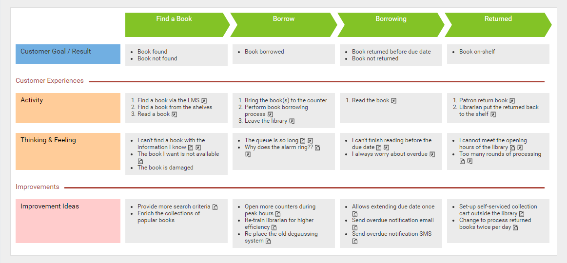
What is Customer Journey Mapping

Introducing Customer Journey Mapping, a popular Customer Experience tool. It visualizes an end-to-end customer experience, helping businesses deepen their understanding of their customers' behaviors, thoughts, and feelings.

Hi, this is Jick Yeung from Visual Paradigm. In this video I am going to introduce you to Customer Journey Mapping, which is a popular tool to use in customer experience management.

This is a customer journey map. People create a map like this to visualize the thoughts and feelings customers have during the engagement with an organization, service, product or brand over time. The idea is pretty simple. Let me give you a quick overview now.

I’ll explain with a case study of a tours company.

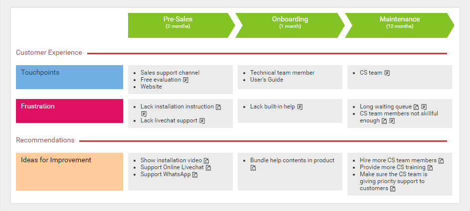
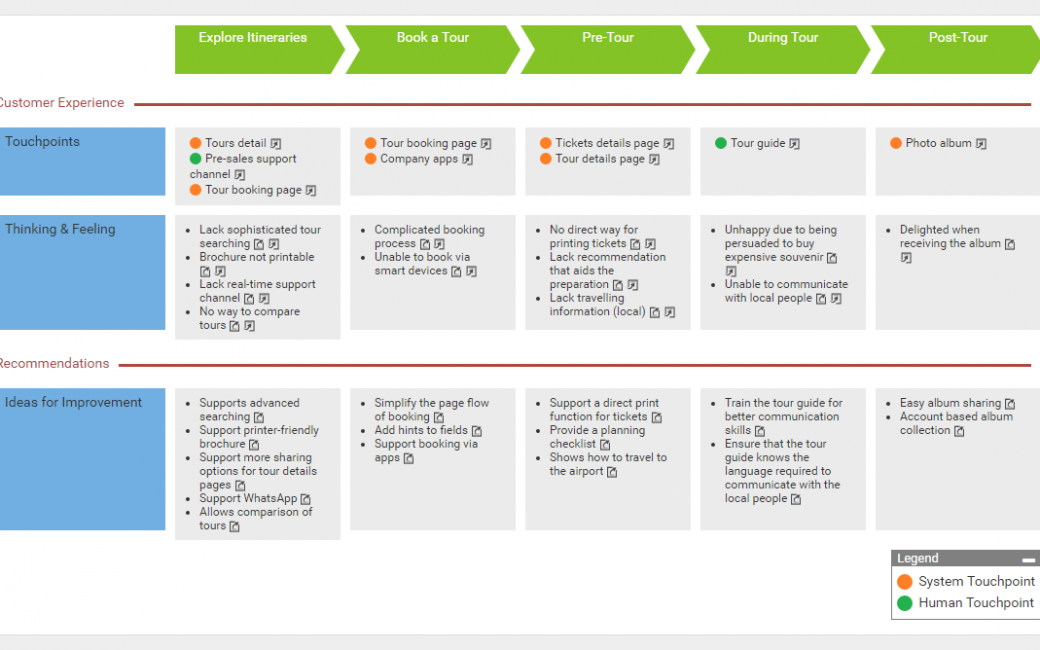
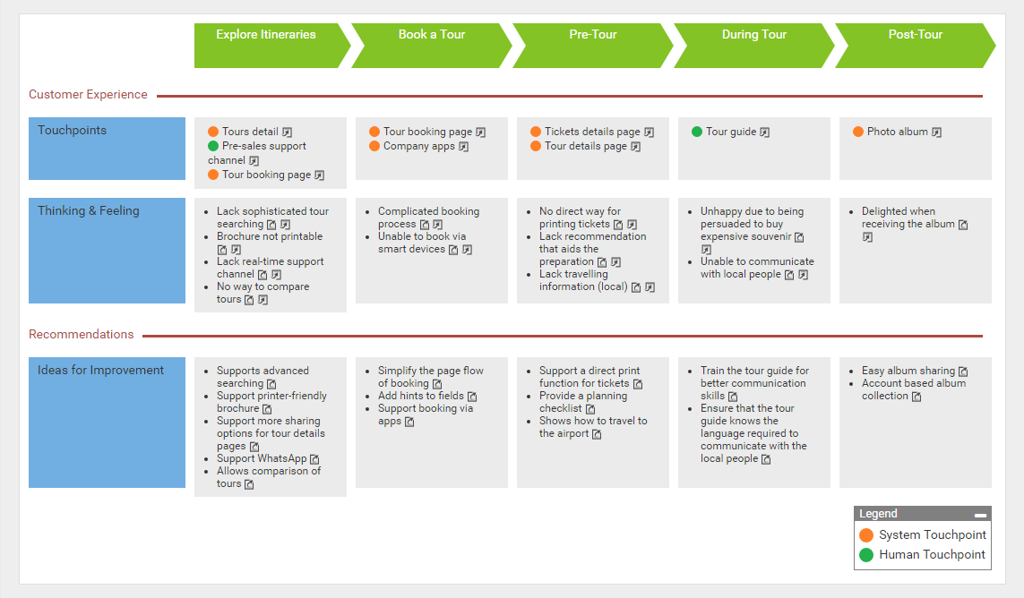
Let’s say I’m a manager of a tours company, and I want to know about how the customers feel about our touring services. In particular I’m interested to know about the bottlenecks they experience. The first thing I have to do is to list out the stages of the entire journey, from exploring itineraries, to booking a tour, pre-tour (Pre-tour is where the customer prepare for the tour), during the tour and post tour. Keep in mind that a customer journey map must be drawn from customers’ perspective. It describes the activities the customer would undertake, in words the customer might use. So you see the stage Explore Itineraries here, instead of something like “provide tour details”.

For each stage, identify the customer touchpoints. A touchpoint is any time a potential customer or customer comes in contact with your brand. Here are the touchpoints of the stage explore itineraries.

Company website. A potential customer come to our website to find information about tours.

Advertisement. A potential customer knows our offer from advertisements.

Social media. A potential customer comes to our social media accounts and sees our offers there.

These are the touchpoints. Sometimes, touchpoints are written as customer actions like surfing the company website and reading advertisement.

Once the touchpoints are identified, I’ll start to identify what the customers think and how they feel for each touchpoint. What do the potential customers think when they visit our website to find tours information? Are they happy, unhappy or even frustrated with our services? Think as a potential customer and list out all the customer thinking and feeling. Here are some examples.

They are pleased with the rich tours details we provide.

They are unhappy due to the lack of real time support.

They are unhappy because the brochure are not printer friendly.

Finally, based on these finding I can think of the possible solutions. Since the potential customers want real-time support, we may consider supporting a live-chat function, as well as to setup a company Whatsapp account.

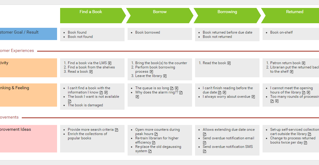
By putting together the stages, the touchpoints, customer’s thinking and feeling and ideas for improvement together, a map is formed, and this is a customer journey map.

A journey map makes visible the interactions between customers and the business. It identifies the blockages that might prevent customers from proceeding smoothly, and develop a holistic view of customer experiences.

So when should Customer Journey Mapping be utilized? Here are some situations where you will benefit from Customer Journey Mapping.

If you believe that there are bottlenecks in the current business but not sure where they are nor how to get rid of them, create a customer journey map to find them out.

If you have adopted a new business strategy that brings new customers to your business, you may want a studying of their experiences. An example would be a boutique that offers online shopping option which attracts a new group of potential customers who prefer online shopping.

If your business is offering an entirely new service that requires a thorough studying of customer experience. An example would be a supermarket that offers free delivery service lately.

If there are significant business changes like a merger of two companies, you might want to ensure that customer experience is not affected.

Finally, when you want to ensure that different business units are collaborating seamlessly with each other in delivering a seamless and consistent service to customers.

Now, let’s take a look at how to utilize customer journey map in practice.

The first step is to identify the customers who are relevant to your journey and the scope of activities you would like to assess.

After that, you invite the customers or their representatives to a journey mapping workshop. You ask them about their thoughts and feelings at each stage of the journey.

With the information gathered, create a customer journey map. Very often step 2 and 3 are iterative, which means that customers will review and comment on the map, and then you review it, customers will then review again, until the map can accurately reflect the customers’ experience.

Improvement opportunities are identified. The next step is to create action plans for discussing and implementing the improvement ideas stated in the map.

Visual Paradigm supports a set of tools that help.

If the improvement is about a change on business workflow, you may represent the new workflow by drawing a business process diagram.

If the improvement is about adding new system functions or to re-engineer the existing system, you may model the changes with UML diagrams.

If further discussions on user experiences are required, you may draw wireframes for screen mockups.

ArchiMate diagram can be drawn to represent the architecture of business, information system and technology domains, if the improvement may result if architectural changes of the enterprise.

The final step is to implement the improvement ideas, and to make them effective.

Besides developing a customer journey map loosely, you can optionally integrate it with other parts of your model. Take this use case diagram as example. It visualizes the use cases of an online bookstore. The use case Order Books here means that the need of book ordering will be supported by the system.

You can attach sub-diagrams to all model elements, which includes but not limited to use cases.

Here is an example. The use case Order Books can hold a sequence diagram that visualizes its system flow, and a state machine diagram that shows the internal state changes. Similarly, you can assess the customer experience of a use case by attaching a customer journey map as a sub-diagram of that use case.

In this example, we can develop a customer journey map to demonstrate the customer experience throughout an ordering process. Perhaps there are touchpoints like the book details page, the buy page. Customers may feel unhappy, because the page lacks a shopping cart, and then we can wrap up an improvement suggestion, which is to develop a shopping cart.

Besides integrating a journey map with use case, you can also integrate it with other modeling artifacts. If use case is too high level, you may want to apply customer journey mapping on a specific UML action, which represents a system function model. Or to examine the customer experiences for real world business activities by creating journey maps for individual sub-processes. You may also perform customer experience mapping on business processes modeled in ArchiMate diagrams.

In the next few minutes I’ll show you how to develop a customer journey map in Visual Paradigm. Let’s start.

[Demonstration]

This is Visual Paradigm, the Start page of Visual Paradigm. Customer Journey Map is a kind of diagram, so I create a new diagram first. Select Diagram. Click New. I search for Customer Journey Map. The short form is CJM. Select Customer Journey Map and click Next. Enter the diagram name. Next, enter the diagram name. I would suggest you enter the name of the journey here. I'm going to demonstrate the use of customer journey map in representing the customer experiences of tour service, so I name the diagram Take Tour. I click OK to confirm.

This creates blank customer journey map… It’s not really blank because you see some stages and some lanes created for you by default. What I have to do is to rename the stages, or remove, or add stages, and to enter the touchpoints, customer thinking and feelings, and enter the improvement ideas. I will show you step by step. I'll start by entering the stages. The first one, Explore Itineraries. The second one Book a Tour. The third one, Pre-Tour. The fourth one, During tour.

I need one more stage. Post Tour.

And that’s it for stages. After that I'm going to enter the touchpoints of the first stage Explore Itineraries. Double click on this cell. This is the interface where I can enter and edit the touchpoints. So I enter the first touchpoint “Tours detail”.

You can optionally enter a description. I will explain the use of reference in a minute. And I enter the second touchpoint “Pre-sales supports channel”. Enter the description. The third touchpoint “Tour booking page”. Again the description. And confirm. You see three touchpoints are created under the first stage.

Next, think about what the customers think and feel for each touchpoint and list them out in this cell. Again, I double click on the cell and start to enter the customer thinking and feeling one by one. The first one, “Lack sophisticated tour searching”. Again I can enter a description. By the way the description you entered will appear in the report you generate. I will demonstrate the report generation feature in a minute. Again I enter the second one “Brochure not printable”. Enter the description.

And third one, “Lack real-time supports channel”. The description.

The fourth one, “No way to compare tours”. Again the description.

Okay this time I want to talk about the reference, the reference column here. As I said before, touchpoints, thinking and feeling, and the ideas for improvement are interrelated. It's the touchpoints that trigger a customer to produce certain feeling or to think of something, to have some emotional changes which, as a result causes the need of improvement. The reference column here is for you to establish the relationships between them. With the use of reference you have a clear understanding of which touchpoint triggers what's thinking and feeling and what are the ideas proposed to remove or to mitigate the negative feeling customers have. This is the purpose of reference. So I set the reference here.

The point “Lack sophisticated tour searching” is generated when a customer visits the tours detail page. So I select “Tours detail page” here. The second one “Brochure not printable” is again generated when a customer visits the tours detail page. The comments that there is the lack of real-time support channel is generated from the touchpoint “Pre-sales supports channel”. Finally, the comment that there is no way to compare tours was generated when the customer visits the tours booking page.

So I've set all references. Click OK to confirm. You see some tiny icons put after the points. These icons indicate the existences of reference or if an item is being referenced by others.

By the way there is really no fixed or standard schema for customer journey map. If necessary you can customize the map by adding more lanes, like this. Say, you may want to present also the customers’ emotions throughout the journey.

But you don't need such a lane here so I just remove it first.

I move on to the Ideas for Improvement. I want more space so I just collapse this pane first. I’ll reopen it later on.

Okay, Ideas for improvement. Same as before I double click on the cell here to open the editor. Based on the customer experience identified, think of and list out the improvement opportunities. The first one is to “Support advanced searching”.

I can enter a description.

The second one, “Support a printer-friendly brochure”. Again the description.

These ideas are created in response to the customer experience identified before. So here I am going to add references to customer thinking and feeling. And confirm.

Alright I’ve finished entering the customer experience and recommendations for the first stage. Repeat this steps for the other stages.

This completes the journey map. Now the touchpoints, thinking and feeling and ideas for improvements are all represented as bullet points. We provide two alternative presentation options. In this video I want to talk about the label style. Right click on the lane header, like this one, the Touchpoints. And select the item style. There are three styles - Label, bullet points and numbers. The current style is bullet points. I want to present the points as labels, so I select labels. The label style provides you with a way to categorize items. Let’s say I want to categorize the touchpoints into human touchpoints and system touchpoints. Let me show you how to do this.

Double click on this cell. Assign a color label to system touchpoints. Assign another color label to human touchpoints. Repeat these steps on all the other touchpoints.

Finally I name the two color code as system touchpoint and human touchpoint.

This is how the label style works. Now I want to show you how to generate a report from this customer journey map. You may need this feature when you want to produce a document for communication. To generate a report, expand its pane. Double-click on this button Customer Journey Mapping to generate a document file. Confirm.

This is the generated report. This is the map, the image. These are the details I entered for each stage which include the touchpoints, customer thinking and feeling, and ideas for improvements. And the next stage, the next stage and so forth.

If you just want an image instead of a document you can do this. Select Project from the toolbar and select Export Active Diagram as Image, save the image. And this is the image file exported.

Before I go I want to show you how to integrate a customer journey map with a visual model. I will use a use case model as an example. Here is a use case, “Cancel Order”. I want to study the customer experience associated with order cancelling.

To do this click on this tiny sub-diagram icon. Select New Diagram. Choose customer journey map and confirm. So now I can start to develop the map. Say, the first stage is “Before cancellation”. There is a touchpoint “Terms and conditions page”. And I confirm it. Go back to the use case diagram. The customer journey map is stored under the use case now. From now on I can open a customer journey map from the use case, like this.

Okay this is the end of this video. I hope you will find customer journey map useful. If you want more information please visit our website www.visual-paradigm.com.

Goodbye!

Posts navigation

1 2 3 7 8 9 10 11 12 13 45 46 47