Adjust the size of frame
If you find the frame too large or too small, you can resize it to your preferred size. To adjust the size of frame:
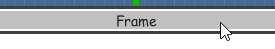
- Click on the frame’s title bar.
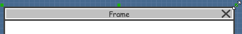
- This shows the resize handlers at the corners and edges of the frame. You can drag on them to resize the frame.
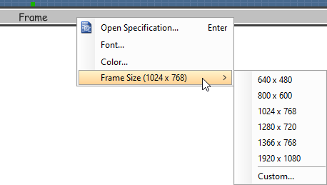
Alternatively, you can right click on the frame’s title bar and select Browser Size > %PREFERRED_SIZE% from the popup menu.
Scroll to device
If you have scrolled to somewhere far away from the wireframe, you can scroll jump back to the main frane by right clicking on the background of the wireframe and selecting Scroll to Device from the popup menu. The wireframe will re-appear at the center of the window immediately.
Creating a wireframe element
Method 1 – Diagram toolbar: Select-and-Click
- Select the desired wireframe element from the diagram toolbar (e.g. Label).
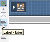
- Click on the wireframe, at the position where you want the wireframe element to be created.
Method 2 – Diagram toolbar: Drag and drop
- Press on the desired wireframe element in the diagram toolbar
- Hold the mouse button.
- Drag to the wireframe.
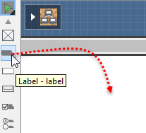
- Release the mouse button in the wireframe, at the position where you want the wireframe element to be created.
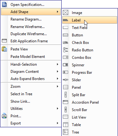
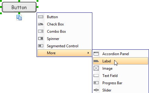
Method 3 – Popup menu
- Right click on the wireframe, at the position where you want the wireframe element to be created.
- Select Add Shape > %SHAPE_TYPE% from the popup menu, where %SHAPE_TYPE% is the kind of wireframe element you want to create.
Method 4 – Through smart create resource
- Click directly on the wireframe, at the position where you want the wireframe element to be created. You should see a green icon appear, known as the Smart Create resource.

- Press on the Smart Create resource and hold the mouse button.
- Drag to outline the size of the wireframe element to be created.
- Release the mouse button. In the popup menu, choose the type of wireframe element to be created.
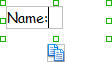
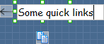
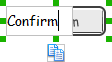
Method 5 – Double-clicking (Label and annotation only)
To create a label, double-click on the wireframe and enter the label caption.
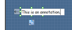
To create an annotation, double-click outside the frame and enter the annotation text.
Accurate positioning of wireframe element using the alignment guide
Alignment guide is a dotted line that appears when you move wireframe elements in a wireframe. It helps you to align elements perfectly with others. Simple select element(s) and drag it around. When the selection approaches another element in the wireframe, you can adjusting the positioning of selection with the help of the guide.
Adjusting font property for wireframe elements
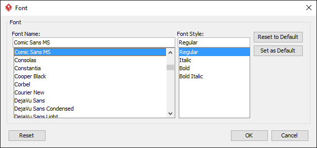
For wireframe elements that can display text, you can adjust their font properties like the font familiy and font style. To adjust font properties:
- Right click on the desired wireframe element and select Font… from the popup menu.
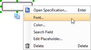
- Edit the font properties in the Font window and click OK to confirm.
Setting color for wireframe elements
In case you want to colorize your wireframe, you can set the color of wireframe elements by taking the steps below.
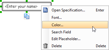
- Right click on the desired wireframe element and select Color… from the popup menu.
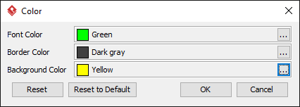
- Edit the color properties in the Color window and click OK to confirm. Note that different wireframe elements support different settings. For example, while text field support editing font color, list view doesn’t.
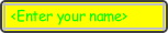
You will then see the new color applied.
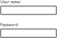
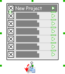
Duplicating wireframe elements
Duplicate wireframe elements enables you to create new elements based on existing ones. This saves you a lot of time in creating elements with same/similar style, size and content to the existine ones.
To duplicate wireframe elements:
- Drag in the wireframe to select a range of elements to duplicate.
- At the bottom of your selection, press on the Duplicate resource icon and hold the mouse button.
- Drag it.
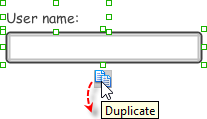
- Release the mouse button at the position where you want the wireframe element to be created.
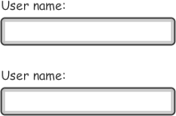
- Touch-up the duplicate elements.
| NOTE: | Instead of dragging the Duplicate resource, you may also click on it.. |
Using stereotypes and tagged values in wireframe
Like most model elements, you can add stereotypes and tagged values to wireframe widgets. The stereotype mechanism allows you to create “typed” widgets. For example, you can create a stereotype “password field” for wireframe text field widget. Then, when you draw a wireframe, you can create a “password field” by assigning the “password field” stereotype to a text field.
Tagged values allows you to add custom properties to wireframe widgets. For example you can add a “screen ID” field to widgets for associating the widgets to components in an actual screen design.
You can add and edit stereotypes and tagged values both in the specification of wireframe widgets. To open specification, right click on a widget and select Open Specification… from the popup menu.
Note that the stereotypes and tagged values added to a wireframe widget is shared across all states, which means that you will see the same stereotypes and tagged values added to a widget in all wireframe states.
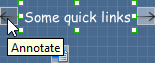
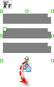
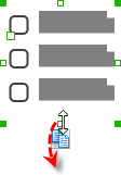
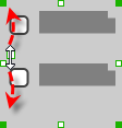
Annotating wireframe with Annotation shape
The use of annotations in wireframe allows you to detail the elements on the wireframe. With annotation, you can describe or explain the existence of certain wireframe element, as well as to describe the calls to action and the expected results.
In order to keep the wireframe content readable, annotations are forced to put outside the frame. In other words, you cannot create or move an annotation to inside the frame area.
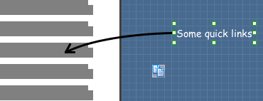
To create an annotation:
- Double click on the background (i.e. the blue region) of the wireframe.
- Enter the annotation text.
- Press on the arrow resource and hold the mouse button.
- Drag to the wireframe element to annotate it.
Wireframing tips – Image
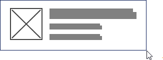
You can use an image component to represent a picture, a placeholder of advertisement, video or map. When you create an image in a wireframe, you see a box with a cross in it. This is how an image should be shown in a wireframe but if you want to specify the content of the image, right click on the image component and select Image from the popup menu. Then, choose the image file (*.jpg, *.jpeg, *.gif, *.png, *.bmp) to embed into the image component.
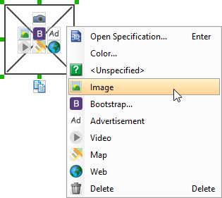
To represent an advertisement, video or map, right click on the image component and select Advertisement, Video and Map respectively.

Wireframing tips – Label
Specifying the content of label
To specify the content of label, double click on the label and enter the content. You can press Enter to create a new line or press Ctrl-Enter to confirm editing. You may need to resize the label afterwards in order to see the content entered.
Showing multiple labels
The label component is in fact a placeholder of label. You can show multiple labels in it by increasing the height of the label component.
To adjust the spacing between labels in a label component, select the label and drag the handler attached with the second label. Space will be added by dragging downwards.
| NOTE: | When a label has specified, you cannot show multiple labels in it. |
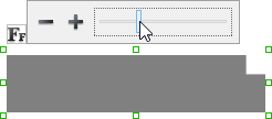
Adjusting label or font size
The size of label(s) or text in label, when content is filled, can be changed. To adjust font, click on the label component. Then, click on the Font Sizebutton. After that, drag the slider or press + or – to adjust the font size.
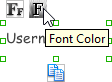
Adjusting font color
When a label component has text content filled, you can set its color by clicking on the label component first. Then, click on the Font Color button. After that, edit the color properties in the Color window and click OK to confirm.
Wireframing tips – Text Field
Specifying the content of text field
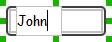
To specify the content of text field, double click on the text field and enter the content. You may need to resize the text field afterwards in order to see the content entered.
Showing the text field as a search field
Search field is a kind of text field that allows user to specify a search string and trigger searching. To show a text field as a search field, right click on the text field component and select Search Field from the popup menu.
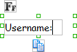
Editing the placeholder text
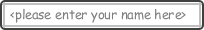
Placeholder text is the text that appears in the background of a text field. Very often, placeholder text is used to provide hints for user. For example, a text field of user name may have <please enter your name here> as placeholder text. Note that the placeholder text is only active when no content has been specified for the text box. To edit placeholder text of a text field, right click on the text field component and select Edit Placeholder… from the popup menu. Then, enter the placeholder text in the popup dialog box.
Wireframing tips – Button
Setting the type of button
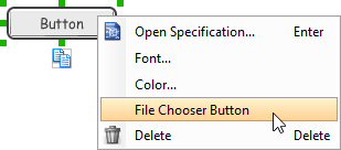
There are two kinds of button – general button and file chooser button. General button is what you commonly see in any user interface. You click on a general button to do something as description by the button caption. File chooser button is a special kind of button that allows users to provide a file by clicking on the button. A file chooser button is followed by the text “No file chosen”.
When you create a button, it is a general button by default. To change make it a file chooser button, right click on the button and select File Chooser Button from the popup menu.
Editing button caption
To edit the caption of button, double click on the button and enter the caption. You may need to resize the button afterwards in order to see the caption entered. Note that the caption of a file chooser button is not editable.
Wireframing tips – Checkbox
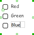
Creating the checkboxes
The checkbox component is in fact a placeholder of checkboxes. You can show multiple checkboxes in it by increasing the height of the checkbox component.
To adjust the spacing between checkboxes in a checkbox component, select the checkbox and drag the handler between the first and the second checkbox. Space will be added by dragging downwards.
Specifying the value of checkbox
To specify the value of a checkbox, double click on the label attached with the checkbox and enter the value. You may need to resize the checkbox afterwards in order to see the content entered.
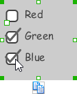
Checking a checkbox
To check a checkbox, simply click on the checkbox. You can uncheck it by clicking again.
Wireframing tips – Radio Button
Creating the radio buttons
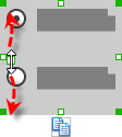
The radio button component is in fact a radio button group. You can show multiple radio buttons in it by increasing the height of the radio button component.
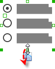
To adjust the spacing between radio buttons in a radio button component, select the radio button and drag the handler between the first and the second radio button. Space will be added by dragging downwards.
Specifying the value of radio button
To specify the value of a radio button, double click on the label attached with the radio button and enter the value. You may need to resize the radio button afterwards in order to see the content entered.
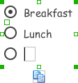
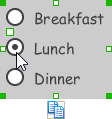
Selecting a radio button
To select a radio button, simply click on the radio button. You can uncheck it by clicking again.
Wireframing tips – Combo Box
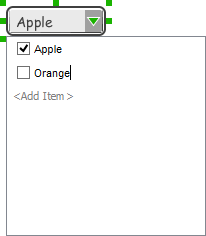
Specifying the items in a combo box
By default, a spinner has no items specified. You can add a list of items into a spinner by clicking on the down arrow on the right of the spinner and then click on <Add Item> and start entering the item.
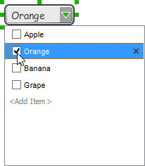
Changing the selected item in a combo box
To change the selected item of a combo box, click on the down arrow on the right of the combo box, then check the item to select it.
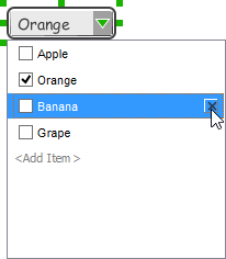
Removing an items from a combo box
To remove an item from a combo box, click on the down arrow on the right of the combo box, then select the item to remove and click on the cross button on the right to remove it.
Wireframing tips – Spinner
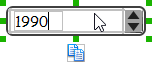
Specifying the value in spinner
To edit the value of a spinner, double click on the spinner and enter the value. You may need to resize the spinner afterwards in order to see the value entered.
Wireframing tips – Progress Bar
Adjusting the progress
To adjust progress, select the progress bar first. Then drag the handler in the middle towards left or right to control the progress.
Wireframing tips – Slider
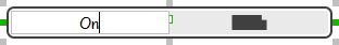
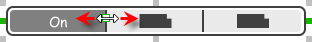
Adjusting the slider position
To adjust silder position, select the silder first. Then drag the handler in the middle towards left or right to control the position.
Wireframing tips – Panel
Containing existing components with panel
Panel is a useful wireframe component that helps you visualize the different areas of a screen design. You can put other wireframe components in a panel and move the panel around to reposition the wireframe components at the same time.
To create a panel and make it contains existing components:
- Select Panel from the diagram toolbar.
- Press on the wireframe and hold your mouse button.
- Drag to form the size of the panel to be created. Wireframe components contained entirely in the drag range will be contained by the panel.
- Release the mouse button to create the panel.
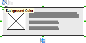
Changing background color
To change the background color of a panel, click on the panel first. Then, click on the Background Color button on top of the panel. After that, edit the color properties in the Color window and click OK to confirm.
Hiding the border of panel
To hide the border of panel, click on the panel first. Then, click on the Hide Border button. You can click again to show the border again.
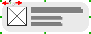
Making the corner of panel rounded
To make the corner of a panel rounded, click on the panel first. Then, drag on the handler at top left to adjust the size of the rounded corner. The four corners will be updated accordingly.
Changing a panel to a titled pane or tabbed pane
A panel can be presented as a titled pane or tabbed pane. To do this, right click on the panel and select Type > Titled Pane or Type > Tabbed Panefrom the popup menu.
When presented as titled pane or tabbed pane, you can edit the caption of the pane or tabs by double clicking on captions.
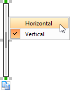
Wireframing tips – Split Bar
Changing the orientation
To change the orientation of a split bar, right click on it and select either Horizontal or Vertical from the popup menu.
Wireframing tips – Accordion Panel
Editing the header
To edit table header, double click on the table header and enter the content. You may need to resize the header in order to see the text entered.
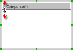
Adjusting header height
To adjust header height, drag on the handler below the header.
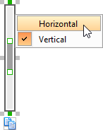
Wireframing tips – Scroll Bar
Changing the orientation
To change the orientation of a scroll bar, right click on it and select either Horizontal or Vertical from the popup menu.
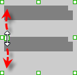
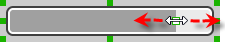
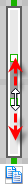
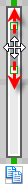
Adjusting the scroll thumb (i.e. scrollbar slider)
To change the length of the thumb, select the scrollbar first. Then, drag on the handler attached to the ends of the thumb to resize it.
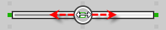
To adjust the position of thumb, select the scrollbar first. Then, drag on the thumb along the track to reposition it.
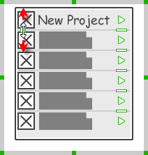
Wireframing tips – List View
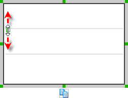
Adjusting row height (for single row)
To adjust the height of a row, drag directly on the row separator under the row. By doing so, the row will be expanded or contracted.
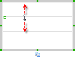
Adjusting rows height (for all rows)
To adjust the height of all rows in a list view, drag on the handler attached to the row separator between the first and the second row to resize all rows at the same time.
Wireframing tips – Table
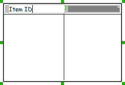
Editing table header
To edit table header, double click on the table header and enter the content.
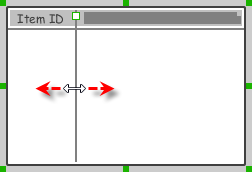
Adjusting column width
To adjust column width, drag directly on the column separator nearby. By doing so, the adjacent columns will be updated in their width.
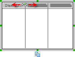
Adding more columns
To add more columns to a table, select the table first. Then, drag on the handler attached to the column separator between the first and the second column to create more columns.
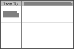
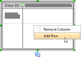
Adding more rows
When you put a wireframe component (e.g. a label component) into a table component, a new row will be created automatically.
You may also add a row manually by right clicking on the table and selecting Add Row from the popup menu.
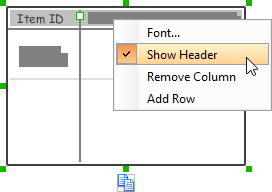
Hiding table header
To hide away the table header, right click on the header and uncheck Show Header from the popup menu.
Wireframing tips – Tree
Editing the name of a tree node
To edit the name of a tree node, double click on the tree node and enter the name.
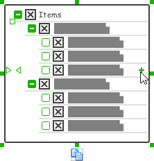
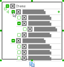
Adding an adjacent tree node
To add a tree node next to an existing one, select the tree first. Then, move the mouse pointer over the existing tree node where the new node will be created next to it. Click on the + button on the right of the tree node.
Adding a child tree node
To add a tree node under an existing one as child node, select the tree first. Then, move the mouse pointer over the existing tree node where the new node will be created under it. Click on the empty box on the right of the tree node. The box will then become a solid box with + in it. Click again, a child node will be created under it.
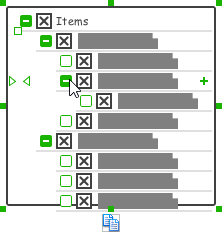
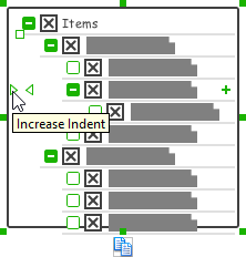
Adjusting the level of indentation of tree node
To adjust the level of indentation of a tree node, select the tree first. Then, move the mouse pointer over the existing tree node where you want to adjust its level of indentation. Click on the < or > on the left of the tree node to make the node one level backward or forward.
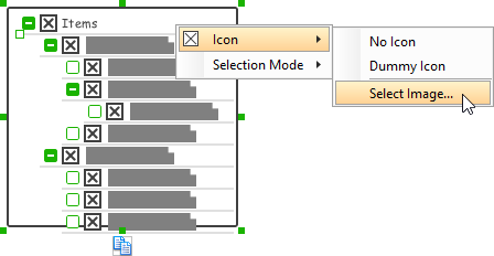
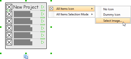
Specifying icon for ALL tree nodes
You can optionally specify an image icon for all of your tree nodes. To specify an icon, de-select the tree first. Then, right click on the tree component and select Icon > Select Image… from the popup menu. If you want to have no icons for all tree nodes, select No Icon. If you want an icon but do not want to specify its content, choose Dummy Icon. Make sure you are not clicking on a specific tree node or else only that node will be updated.
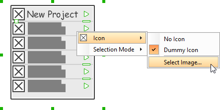
Specifying icon for a specific tree node
You can optionally specify an image icon for a specific tree node. To specify an icon, select the tree first. Then, right click on the tree node to specify icon and select Icon > Select Image… from the popup menu. If you want a node without icon, select No Icon. If you want an icon but do not want to specify its content, choose Dummy Icon.
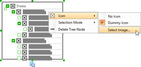
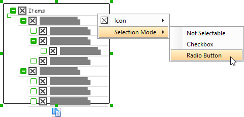
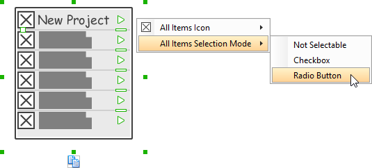
Adjusting the selection mode for ALL tree nodes
There are three selection modes for a menu item – Not Selectable, Chekcbox and Radio Button. To adjust the selection mode of all tree nodes, de-select the tree first. Then, right click on the tree component and select Selection Mode > [MODE] from the popup menu. Make sure you are not clicking on a specific tree node or else only that node will be updated.
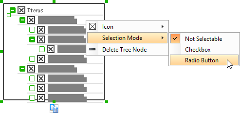
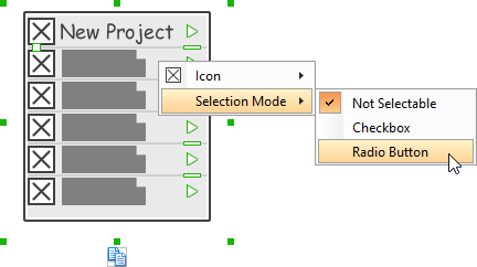
Adjusting the selection mode for a specific tree node
There are three selection modes for a menu item – Not Selectable, Chekcbox and Radio Button. To adjust the selection mode of a tree node, select the tree first. Then, right click on the tree node and select Selection Mode > [MODE] from the popup menu.
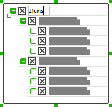
Expanding and collapsing a tree node
To expand or collapse a tree node, click on the + or – button on the left of a tree node.
Wireframing tips – Dialog
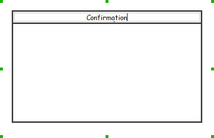
Editing the title
To edit title of dialog, double click at the top of the dialog enter the content.
Wireframing tips – Toolbar
Representing buttons in a toolbar
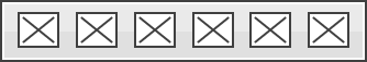
By default, a toolbar is just an empty horizontal bar. To represent the buttons in toolbar, you can either create buttons in it or represent with an image component, like this:
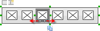
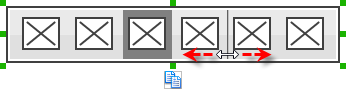
Representing a button being selected
To represent a button being selected:
- Click on the toolbar first.
- Click on the resource Show Selection Background.
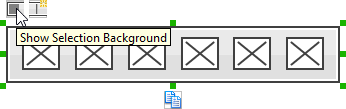
- Drag on the selection background to the suitable place to indicate the active selection of button.
Adding separator
To add a separator, click on the toolbar first. Then, click on the resource Add Separator. You can then drag the separator to reposition it.
Wireframing tips – Menu Bar
Editing the name of a menu
To edit the name of a menu in menu bar, double click on the menu and enter the name.
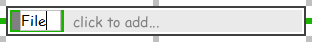
Adding more menus
To add more menus to a menu bar, select the menu bar first. Then, click on click to add… and enter the name of the new menu.
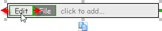
Rearranging menus
To rearrange menus, select the menu bar first. Then, drag on a menu and move it along the menu bar to reposition it.
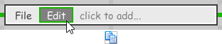
Indicating the selected menu
To indicate that a menu has been selected, select the menu bar first. Then, click directly on the menu to make it appear as selected.
Wireframing tips – Menu
Editing the name of a menu item
To edit the name of a menu item in menu, double click on the menu item and enter the name.
Adding more menu items
You can add more menu items to a menu by increasing the height of the menu component.
Adjusting label or font size
The size of label(s) or menu items, when name is specified, can be changed. To adjust font, drag the slider between the first and the second menu item to adjust the font size.
Specifying icon for ALL menu items
You can optionally specify an image icon for all of your menu items. To specify an icon, de-select the menu first. Then, right click on the menu component and select Icon > Select Image… from the popup menu. If you want all menu items to have no icon, select No Icon. If you want an icon but do not want to specify its content, choose Dummy Icon. Make sure you are not clicking on a specific menu item or else only that node will be updated.
Specifying icon for a specific menu item
You can optionally specify an image icon for a specific menu item. To specify an icon, select the menu first. Then, right click on the menu item to specify icon and select Icon > Select Image… from the popup menu. If you want a menu item without icon, select No Icon. If you want an icon but do not want to specify its content, choose Dummy Icon.
Adjusting the selection mode for ALL menu items
There are three selection modes for a menu item – Not Selectable, Chekcbox and Radio Button. To adjust the selection mode of all menu items, de-select the menu first. Then, right click on the menu component and select Selection Mode > [MODE] from the popup menu. Make sure you are not clicking on a specific menu item or else only that node will be updated.
Adjusting the selection mode for a specific menu item
There are three selection modes for a menu item – Not Selectable, Chekcbox and Radio Button. To adjust the selection mode of a menu item, select the menu first. Then, right click on the menu item and select Selection Mode > [MODE] from the popup menu.
Specifying the selected menu item
To represent that a menu item has been selected, specify the selected menu item by selecting the menu first. Then, click directly on the menu item to make it appear selected.
Adding separator to menu
To add a separator, select the menu first. You will see a number of short horizontal line on the right of the menu. You can then click on them to show the separators.
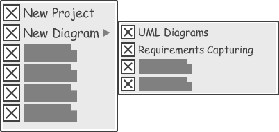
Representing nested menu structure
To represent a nested menu structure:
- Click on the menu.
- Click on the triangle button on the right of the menu item where the sub-menu pops out.
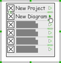
- Create another menu next to it.
Wireframing tips – Segmented Control
Editing the title of a segment
To edit the title of a segment, double click on the segment and enter the title.
Adding more segments
To add more segments to a segmented control, select the segmented control first. Then, drag on the handler attached to the segment separator between segments to create more segments.
Changing the selected segment
To change the selected segment, select the segmented control first. Then, click on the segment directly in the segmented control.
Wireframing tips – Rectangle
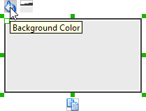
Changing background color
To change the background color of a rectangle, click on the rectanglefirst. Then, click on the Background Color button on top of the rectangle. After that, edit the color properties in the Color window and click OK to confirm.
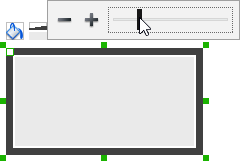
Adjusting the thickness of border
To adjust the thickness of the border of a rectangle, click on the rectangle first. Then, click on the Line Width button. After that, drag the slider or press + or – to adjust the thickness.
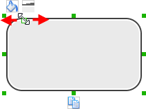
Making the corner of rectangle rounded
To make the corner of a rectangle rounded, click on the rectangle first. Then, drag on the handler at top left to adjust the size of the rounded corner. The four corners will be updated accordingly.
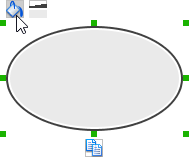
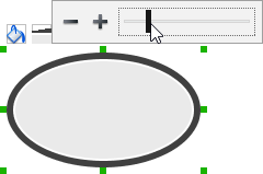
Wireframing tips – Oval
Changing background color
To change the background color of an oval, click on the oval first. Then, click on the Background Color button on top of the oval. After that, edit the color properties in the Color window and click OK to confirm.
Adjusting the thickness of border
To adjust the thickness of the border of an oval, click on the oval first. Then, click on the Line Width button. After that, drag the slider or press + or – to adjust the thickness.
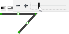
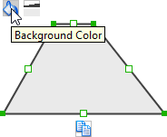
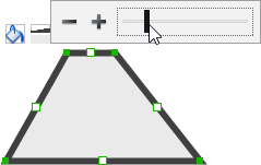
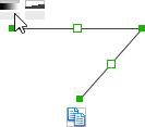
Wireframing tips – Polygon
Adding a side
To add a side, select the polygon first. Then, drag on the white handler attached to the border of the polygon to split a border into two.
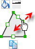
Then adjust the position of the new point.

Changing background color
To change the background color of a polygon, click on the polygon first. Then, click on the Background Color button on top of the polygon. After that, edit the color properties in the Color window and click OK to confirm.
Adjusting the thickness of border
To adjust the thickness of the border of a polygon, click on the polygon first. Then, click on the Line Width button. After that, drag the slider or press + or – to adjust the thickness.
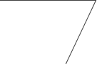
Wireframing tips – Line
Adding a point
To add a point, select the line first. Then, drag on the white handler on the line to create a new point.

Then adjust the position of the point.
Changing border color
To change the border color of a line, click on the line first. Then, click on the Border Color button on top of the line. After that, edit the color properties in the Color window and click OK to confirm.
Adjusting the line width
To adjust the width of the border of an oval, click on the line first. Then, click on the Line Width button. After that, drag the slider or press + or – to adjust the width.