Bootstrap components provide you with modern look and appearance for controls to use in web development. In this article you will see how to use bootstrap components in website wireframing.
Bootstrap template
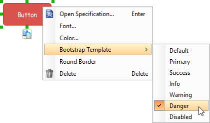
A bootstrap template is a theme that gives bootstrap components a consistent and unified appearance. All bootstrap components can be presented in any of the 7 bootstrap templates – Default, Primary, Success, Info, Warning, Danger, Disabled. To apply a bootstrap component on a component, right click on that component and select Bootstrap Template > %TEMPLATE% from the popup menu, where %TEMPLATE% is an available type.
Note that when you select a color yourself for a bootstrap component, bootstrap template will be set to Unspecified.
Wireframing tips – Badge
Badge is used in showing counts. A typical usage is to for presenting the number of unread emails.
Editing badge caption
To edit the caption of badge, double click on the badge and enter the caption.
Wireframing tips – Breadcrumb
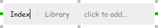
Editing the name of a breadcrumb item
To edit the name of an item on breadcrumb, double click on the item and enter the name.
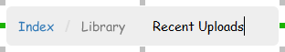
Adding more items
To add more menus to a breadcrumb, select the breadcrumb first. Then, click on click to add… and enter the name of the new item.
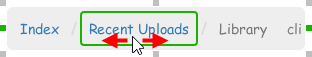
Rearranging items
To rearrange items, select the breadcrumb first. Then, drag on an item and move it along the breadcrumb to reposition it.
Wireframing tips – Button
Editing button caption
To edit the caption of button, double click on the button and enter the caption. You may need to resize the button afterwards in order to see the caption entered.
Making the border of button rounded
To make the corner of a button rounded, right click on the button and select Round Border from the popup menu.
Wireframing tips – Button Group
Editing button caption
To edit the caption of a button, double click on the button and enter the caption. You may need to adjust the separator between buttons to make the button looks better.
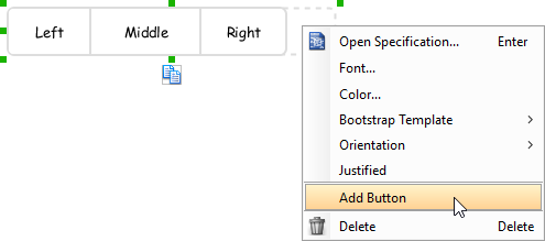
Adding more buttons
To add more buttons to a button gruop, right click on the button group and select Add Button from the popup menu.
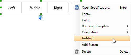
Distribute buttons’ width evenly
To distribute the width of buttons’ in a button group evenly, right click on the button group and select Justified from the popup menu.
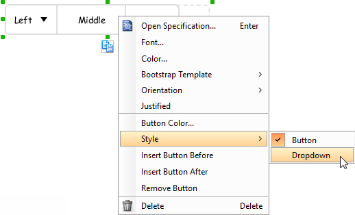
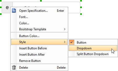
Changing the style of button to be a drop-down button
To make a button looks like a drop-down button (that has an inverted triangle next to its caption), right click on that button and select Style > Dropdown from the popup menu.
You can then configure the font and background of a dropdown button by right clicking on a dropdown button and selecting Dropdown Color… from the popup menu.
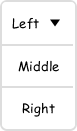
Changing the orientation of button group
You can change a button group to appear vertically by right clicking on it and selecting Orientation > Vertical from the popup menu.
Wireframing tips – Dropdown
Specifying the items in a dropdown
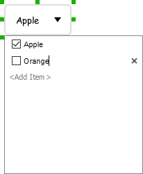
By default, a dropdown has no items specified. You can add into a dropdown a list of items by clicking on the down arrow on the right of the dropdown, and then click on <Add Item> and start entering the item.
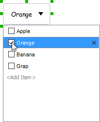
Selecting the selected item in a combo box
To change the selected item of a combo box, click on the down arrow on the right of the combo box, then check the item to select it.
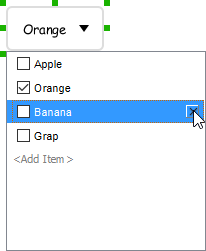
Removing an items from a combo box
To remove an item from a combo box, click on the down arrow on the right of the combo box, then select the item to remove and click on the cross button on the right to remove it.
Wireframing tips – Input Group
Editing button caption
To edit the caption of a button, double click on the label placeholder in the button and enter the caption.
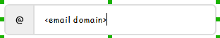
Editing input box text
To edit the text of the input box, double click on the input box and enter the text.
Changing the style of button to be a drop-down button
To make a button looks like a drop-down button (that has an inverted triangle next to its caption) or a split button drop-down (that has an inverted triangle and a separator next to its caption), right click on that button and select Style > Dropdown or Style > Sprint Button Dropdown from the popup menu.
You can then configure the font and background of a dropdown button by right clicking on a dropdown button and selecting Dropdown Color… from the popup menu.
Wireframing tips – List Group
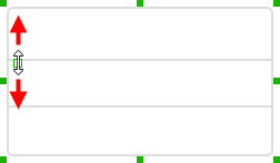
Adjusting row height (for single row)
To adjust the height of a row, drag directly on the row separator under the row. By doing so, the row will be expanded or contracted.
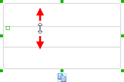
Adjusting rows height (for all rows)
To adjust the height of all rows in a list view, drag on the handler attached to the row separator between the first and the second row to resize all rows at the same time.
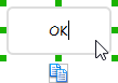
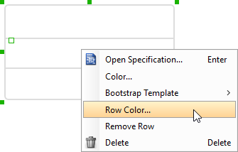
Changing row color (for single row)
To change the background color of a row, right click on that row and select Row Color… from the popup menu. After that, edit the color properties in the Color window and click OK to confirm.
Wireframing tips – Panel
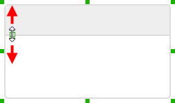
Showing header/footer in panel
To show header in panel, right click on the panel and select Show Header from the popup menu. You can adjust the height of header by dragging on the handler attached to the separator of header. Similarly, you can show footer by right clicking on the panel and selecting Show Footer from the popup menu.
Wireframing tips – Popup
Popup can be used to represent the drop-down menus that show when clicking on a dropdown button.
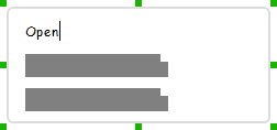
Editing the caption of an item in popup
To edit the caption of an item in popup, double click on the label of item and enter the caption.
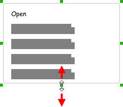
Showing more or less items
To show more items in a popup, drag the handler at the bottom border of the popup downwards to create more labels inside the popup. Similarly, drag upwards to remove any labels from the popup.
Wireframing tips – Tab
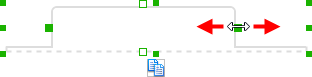
Adjusting the tab position
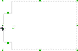
To adjust tab position, select the tab first. Then drag the white handler on top of the tab to control its position.
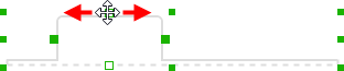
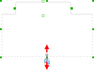
Changing the width of a tab
To change the width of a tab, select the tab first. Then drag on the green handlers on left or right to control its size.
Changing the size of the entire tab panel
To change the size of the entire tab panel, select the tab panel first. Then drag on the green handlers to control its size.
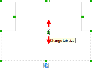
Adjusting tab height
To adjust tab height, select the tab first. Then drag the white handler below the tab to control its height.
Moving a tab to left, right or bottom
By default, a tab is shown on top of a tab panel. You can move a tab to the left, right or bottom by pressing on the white handler on top of the tab, and drag it to the very left, right and bottom side of the tab panel.