Changing the orientation of Android tablet
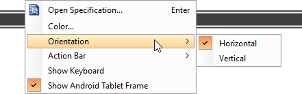
Initially, the Android tablet is shown horizontally in the wireframe. If you apps works under a vertical layout, you can change its orientation. To adjust the orientation, right click on the tablet border and select Orientation > Horizontal/Vertical from the popup menu.
| NOTE: | You can only change orientation when there is no wireframe element created inside the tablet |
Show/Hide action bar
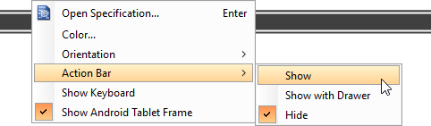
To show the action bar and toolbar, right click on the tablet border and select Action Bar > Show or Action Bar > Show with Drawer from the popup menu.
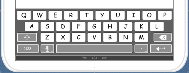
Show/Hide keyboard
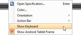
To show the keyboard, right click on the tablet border and select Show Keyboard from the popup menu.
This shows the keybaord at the bottom of the tablet:
Show/Hide Android tablet frame
The frame of the Android tablet is shown by default. If you want to hide it, right click on the background of the wireframe and de-select Show Android Tablet Frame from the popup menu. Note that this option only affects the appearance of the wireframe during editing. The frame will remain visible for images exported or output in document.
Scroll to device
If you have scrolled to somewhere far away from the wireframe, you can scroll jump back to the device by right clicking on the background of the wireframe and selecting Scroll to Device from the popup menu. The wireframe will re-appear at the center of the window immediately.
Creating a wireframe element
Method 1 – Diagram toolbar: Select-and-Click
- Select the desired wireframe element from the diagram toolbar (e.g. Label).
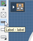
- Click on the wireframe, at the position where you want the wireframe element to be created.
Method 2 – Diagram toolbar: Drag and drop
- Press on the desired wireframe element in the diagram toolbar
- Hold the mouse button.
- Drag to the wireframe.
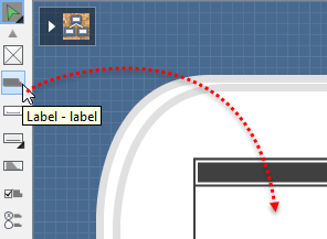
- Release the mouse button in the wireframe, at the position where you want the wireframe element to be created.
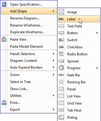
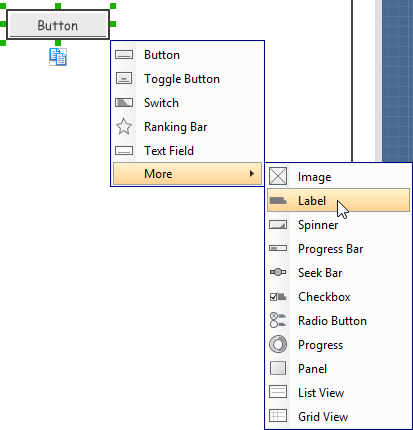
Method 3 – Popup menu
- Right click on the wireframe, at the position where you want the wireframe element to be created.
- Select Add Shape > %SHAPE_TYPE% from the popup menu, where %SHAPE_TYPE% is the kind of wireframe element you want to create.
Method 4 – Through smart create resource
- Click directly on the wireframe, at the position where you want the wireframe element to be created. You should see a green icon appear, known as the Smart Create resource.

- Press on the Smart Create resource and hold the mouse button.
- Drag to outline the size of the wireframe element to be created.
- Release the mouse button. In the popup menu, choose the type of wireframe element to be created.
Method 5 – Double-clicking (Label and annotation only)
To create a label, double-click on the wireframe and enter the label caption.
To create an annotation, double-click outside the tablet and enter the annotation text.
Accurate positioning of wireframe element using the alignment guide
Alignment guide is a dotted line that appears when you move wireframe elements in a wireframe. It helps you to align elements perfectly with others. Simple select element(s) and drag it around. When the selection approaches another element in the wireframe, you can adjust the positioning of selection with the help of the guide.
Adjusting font property for wireframe elements
For wireframe elements that can display text, you can adjust their font properties like the font familiy to use and font style. To adjust font properties:
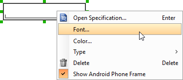
- Right click on the desired wireframe element and select Font… from the popup menu.
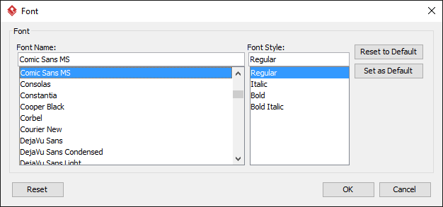
- Edit the font properties in the Font window and click OK to confirm.
Setting color for wireframe elements
In case you want to colorize your wireframe, you can set the color of wireframe elements by taking the steps below.
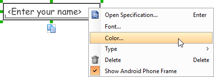
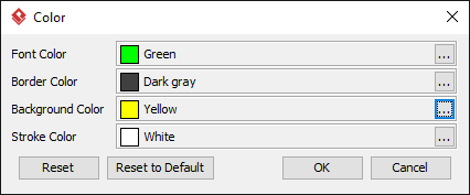
- Right click on the desired wireframe element and select Color… from the popup menu.
- Edit the color properties in the Color window and click OK to confirm. Note that different wireframe elements support different settings. For example, while text field support editing font color, list view doesn’t.
You will then see the new color applied.
Duplicating wireframe elements
Duplicating wireframe elements enables you to create new elements based on existing ones. This saves you a lot of time in creating elements with same/similar style, size and content to the existine ones.
To duplicate wireframe elements:
- Drag in the wireframe to select a range of elements to be duplicated.
- At the bottom of your selection, press on the Duplicate resource icon and hold the mouse button.
- Drag it.
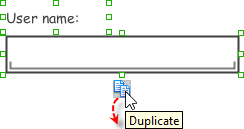
- Release the mouse button at the position where you want the wireframe element to be created.
- Touch-up the duplicate elements.
| NOTE: | Instead of dragging the Duplicate resource, you may also click on it.. |
Using stereotypes and tagged values in wireframe
Like most model elements, you can add stereotypes and tagged values to wireframe widgets. The stereotype mechanism allows you to create “typed” widgets. For example, you can create a stereotype “password field” for wireframe text field widget. Then, when you draw a wireframe, you can create a “password field” by assigning the “password field” stereotype to a text field.
Tagged values allows you to add custom properties to wireframe widgets. For example you can add a “screen ID” field to widgets for associating the widgets to components in an actual screen design.
You can add and edit stereotypes and tagged values both in the specification of wireframe widgets. To open specification, right click on a widget and select Open Specification… from the popup menu.
Note that the stereotypes and tagged values added to a wireframe widget is shared across all states, which means that you will see the same stereotypes and tagged values added to a widget in all wireframe states.
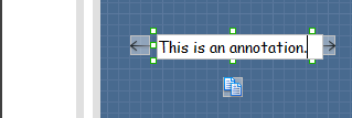
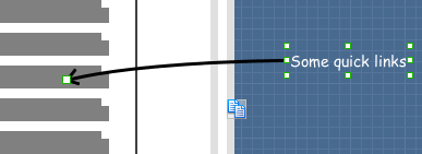
Annotating wireframe with Annotation shape
The use of annotations in wireframe allows you to detail the elements on the wireframe. With annotation, you can describe or explain the existence of certain wireframe element, as well as to describe the calls to action and the expected results.
In order to keep the wireframe content readable, annotations are forced to put outside the tablet. In other words, you cannot create or move an annotation inside the tablet.
To create an annotation:
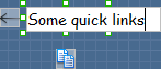
- Double click on the background (i.e. the blue region) of the wireframe.
- Enter the annotation text.
- Press on the arrow resource and hold the mouse button.
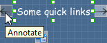
- Drag to the wireframe element to annotate it.
Wireframing tips – Image
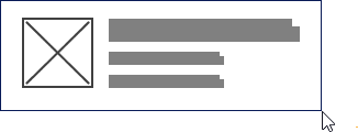
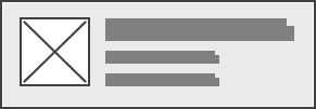
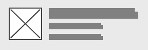
You can use an image component to represent a picture, a placeholder of advertisement, video, map or web component. When you create an image in a wireframe, you see a box with a cross in it. This is how an image should be shown in a wireframe but if you want to specify the content of the image, right click on the image component and select Image from the popup menu. Then, choose the image file (*.jpg, *.jpeg, *.gif, *.png, *.bmp) to be embeded into the image component.
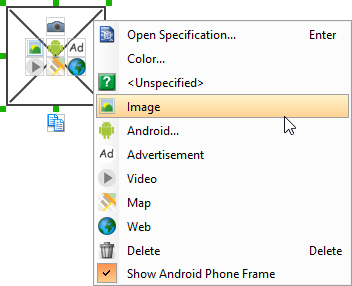
To represent an advertisement, video, map or web component, right click on the image component and select Advertisement, Video, Map and Webrespectively.

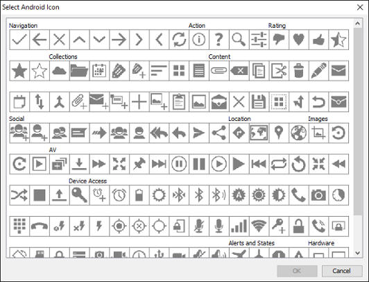
Showing Android icon
You can also use an image component to show an Android icon for a tab bar. To show an Android icon, right click on the image component and select Android… from the popup menu. In the popup window, choose the icon to show and click OK to confirm.
Wireframing tips – Label
Specifying the content of label
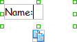
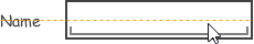
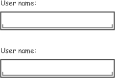
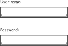
To specify the content of a label, double click on the label and enter the content. You can press Enter to create a new line, or press Ctrl-Enter to confirm editing. You may need to resize the label afterwards in order to see the content entered.
Showing multiple labels
The label component is in fact a placeholder of label. You can show multiple labels in it by increasing the height of the label component.
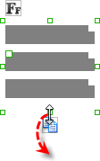
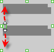
To adjust the spacing between labels in a label component, select the label and drag the handler attached with the second label. Space will be added by dragging downwards.
| NOTE: | When a label has content specified, you cannot show multiple labels in it. |
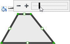
Adjusting label or font size
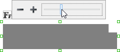
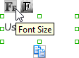
When the content is filled, the size of label(s) or text in label can be changed. To adjust font, click on the label component. Then, click on the Font Size button. After that, drag the slider or press + or – to adjust the font size.
Adjusting font color
When a label component has text content filled, you can set its color by clicking on the label component first. Then, click on the Font Color button. After that, edit the color properties in the Color window and click OK to confirm.
Wireframing tips – Text Field
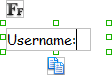
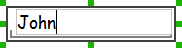
Specifying the content of text field
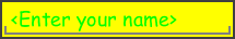
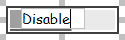
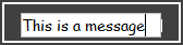
To specify the content of text field, double click on the text field and enter the content. You may need to resize the text field afterwards in order to see the content entered.
Showing the text field as a search field
Search field is a kind of text field that allows user to specify a search string and trigger searching. To show a text field as a search field, right click on the text field component and select Type > Search or Type > Search with Icon from the popup menu.
Wireframing tips – Button
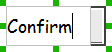
Editing button caption
To edit the caption of button, double click on the button and enter the caption. You may need to resize the button afterwards in order to see the caption entered.
Wireframing tips – Toggle Button
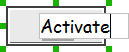
Editing button caption
To edit the caption of button, double click on the button and enter the caption. You may need to resize the button afterwards in order to see the caption entered.
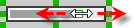
Altering the state of button
To alter the state of a switch, select the switch first. Then, click the line at the bottom of the button to change its state.
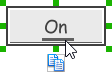
Wireframing tips – Switch
Editing switch caption
To edit the caption of a switch, double click on the text in the switch and enter the caption. You may need to resize the switch afterwards in order to see the caption entered.
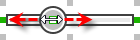
Altering the state of switch
To alter the state of a switch, select the switch first. Then, click on the inactive end of the switch to switch to that end.
Wireframing tips – Checkbox
Creating the checkboxes
The checkbox component is in fact a placeholder of checkboxes. You can show multiple checkboxes in it by increasing the height of the checkbox component.
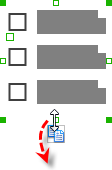
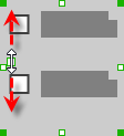
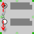
To adjust the spacing between checkboxes in a checkbox component, select the checkbox and drag the handler between the first and the second checkbox. Space will be added by dragging downwards.
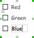
Specifying the value of checkbox
To specify the value of a checkbox, double click on the label attached with the checkbox and enter the value. You may need to resize the checkbox afterwards in order to see the content entered.
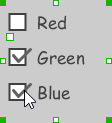
Checking a checkbox
To check a checkbox, simply click on the checkbox. You can uncheck it by clicking again.
Wireframing tips – Radio Button
Creating the radio buttons
The radio button component is in fact a radio button group. You can show multiple radio buttons in it by increasing the height of the radio button component.
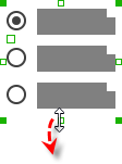
To adjust the spacing between radio buttons in a radio button component, select the radio button and drag the handler between the first and the second radio button. Space will be added by dragging downwards.
Specifying the value of radio button
To specify the value of a radio button, double click on the label attached with the radio button and enter the value. You may need to resize the radio button afterwards in order to see the content entered.
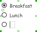
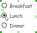
Selecting a radio button
To select a radio button, simply click on the radio button. You can uncheck it by clicking again.
Wireframing tips – Spinner
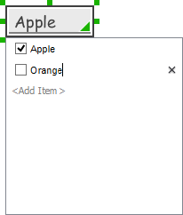
Specifying the items in a spinner
By default, a spinner has no items specified. You can add a list of items into a spinner by clicking on the down arrow on the right of the spinner and then click on <Add Item> and start entering the item.
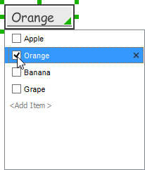
Selecting the selected item in a spinner
To change the selected item of a spinner, click on the down arrow on the right of the spinner, then check the item to select it.
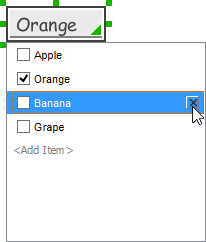
Removing an items from a spinner
To remove an item from a spinner, click on the down arrow on the right of the spinner, then select the item to remove and click on the cross button on the right to remove it.
Wireframing tips – Progress Bar
Adjusting the progress
To adjust progress, select the progress bar first. Then drag the handler in the middle towards left or right to control the progress.
Wireframing tips – Seek Bar
Adjusting the slider position
To adjust silder position, select the seek bar first. Then drag the handler in the middle towards left or right to control the position.
Wireframing tips – Ranking Bar
Adding more stars
To add more stars tp a ranking bar, select the ranking bar first. Then, extend the ranking bar to let more stars appear.
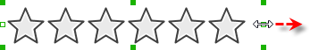
Adjusting the number of filled stars
To adjust the number of filled stars, select the ranking bar first. Then, fill the stars by clicking on a star in the ranking bar.

Wireframing tips – Panel
Containing existing components with panel
Panel is a useful wireframe component that helps you visualize the different areas of a screen design. You can put other wireframe components in a panel and move the panel around to reposition the wireframe components at the same time.
To create a panel and make it contains existing components:
- Select Panel from the diagram toolbar.
- Press on the wireframe and hold your mouse button.
- Drag to form the size of the panel to be created. Wireframe components contained entirely in the drag range will be contained by the panel.
- Release the mouse button to create the panel.
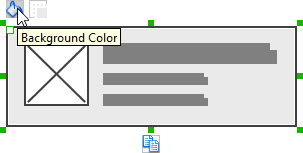
Changing background color
To change the background color of a panel, click on the panel first. Then, click on the Background Color button on top of the panel. After that, edit the color properties in the Color window and click OK to confirm.
Hiding the border of panel
To hide the border of panel, click on the panel first. Then, click on the Hide Border button. You can click again to show the border again.
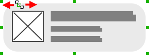
Making the corner of panel rounded
To make the corner of a panel rounded, click on the panel first. Then, drag on the handler on the top-left corner to adjust the size of the rounded corner. The four corners will be updated accordingly.
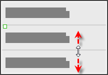
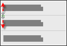
Wireframing tips – List View
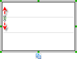
Adjusting row height (for single row)
To adjust the height of a row, drag directly on the row separator under the row. By doing so, the row will be expanded or contracted.
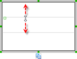
Adjusting rows height (for all rows)
To adjust the height of all rows in a list view, drag on the handler attached to the row separator between the first and the second row to resize all rows at the same time.
Wireframing tips – Grid View
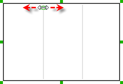
Adjusting column width
To adjust column width, drag directly on the column separator nearby. By doing so, the adjacent columns will be updated in their width.
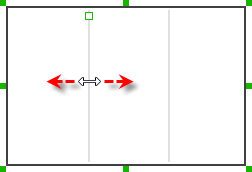
Adding more columns
To add more columns to a table, select the table first. Then, drag on the handler attached to the column separator between the first and the second column to create more columns.
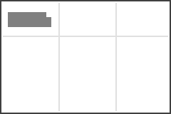
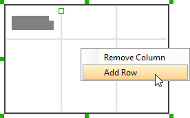
Adding more rows
When you put a wireframe component (e.g. a label component) into a table component, a new row will be created automatically.
You may also add a row manually by right clicking on the table and selecting Add Row from the popup menu.
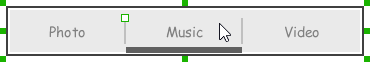
Wireframing tips – Tab Host
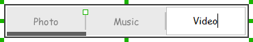
Editing the caption of a tab
To edit the caption of a tab, double click on the tab and enter the title.
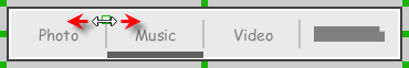
Adding more tabs
To add more tabs to a tab host, select the tab host first. Then, drag on the handler attached to the separator between tabs to create more segments.
Changing the active tab
To change the active tab, select the tab host first. Then, click on the tab directly in the tab host.
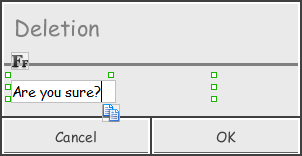
Wireframing tips – Dialog
Editing the content of labels and buttons in a dialog
To edit the content of labels and buttons in a dialog, double click on the label or button and enter the content. You may need to resize the label or the dialog afterwards in order to see the content entered.
Wireframing tips – Menu
Adjusting row height (for single row)
To adjust the height of a row, drag directly on the row separator under the row. By doing so the row will be expanded or contracted.
Adjusting rows height (for all rows)
To adjust the height of all rows in a menu, drag on the handler attached to the row separator between the first and the second row to resize all rows at the same time.
Wireframing tips – Toasts
Editing the message
To edit the message of a toasts, double click on the toasts and enter the message.
Wireframing tips – Rectangle
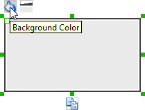
Changing background color
To change the background color of a rectangle, click on the rectangle first. Then, click on the Background Color button on top of the rectangle. After that, edit the color properties in the Color window and click OK to confirm.
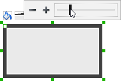
Adjusting the thickness of border
To adjust the thickness of the border of a rectangle, click on the rectangle first. Then, click on the Line Width button. After that, drag the slider or press + or – to adjust the thickness.
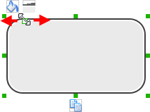
Making the corner of rectangle rounded
To make the corner of a rectangle rounded, click on the rectangle first. Then, drag on the handler at top left to adjust the size of the rounded corner. The four corners will be updated accordingly.
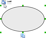
Wireframing tips – Oval
Changing background color
To change the background color of an oval, click on the oval first. Then, click on the Background Color button on top of the oval. After that, edit the color properties in the Color window and click OK to confirm.
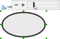
Adjusting the thickness of border
To adjust the thickness of the border of an oval, click on the oval first. Then, click on the Line Width button. After that, drag the slider or press + or – to adjust the thickness.
Wireframing tips – Polygon
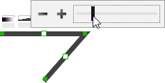
Adding a side
To add a side, select the polygon first. Then, drag on the white handler attached to the border of the polygon to split a border into two.
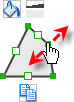
Then adjust the position of the new point.

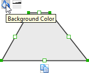
Changing background color
To change the background color of a polygon, click on the polygon first. Then, click on the Background Color button on top of the polygon. After that, edit the color properties in the Color window and click OK to confirm.
Adjusting the thickness of border
To adjust the thickness of the border of a polygon, click on the polygon first. Then, click on the Line Width button. After that, drag the slider or press + or – to adjust the thickness.
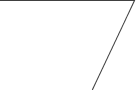
Wireframing tips – Line
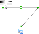
Adding a point
To add a point, select the line first. Then, drag on the white handler on the line to create a new point.

Then adjust the position of the point.
Changing border color
To change the border color of a line, click on the line first. Then, click on the Border Color button on top of the line. After that, edit the color properties in the Color window and click OK to confirm.
Adjusting the line width
To adjust the width of the border of an oval, click on the line first. Then, click on the Line Width button. After that, drag the slider or press + or – to adjust the width.